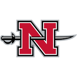
Nicholls State Colonels logo history showcases the steady refinement of the Nicholls State Colonels wordmark logo and its connection to Nicholls State Colonels football. From traditional collegiate lettering to modern athletic typography, these wordmarks reflect school pride, strengthen brand recognition, and support a unified visual identity across generations of competition. Nicholls State Colonels 2009 – Present A letter “N” in …
Nicholls State Colonels Logo History – Alternate Logo
The Nicholls State Colonels logo has evolved through multiple alternate designs, reflecting the team’s enduring history. Each Nicholls State Colonels alternate logo complements the primary emblem. The Nicholls State Colonels logo history shows the progression of designs, while the Nicholls State Colonels football brand and Nicholls State Colonels alternate logo updates showcase the team’s full identity. Nicholls State Colonels 2009 …
Nicholls State Colonels Logo History – Primary Logo
The Nicholls State Colonels logo history traces the evolution of the team’s identity from early designs to the modern emblem. This page highlights the Nicholls State Colonels primary logo, the Nicholls State Colonels football identity, and related visual elements, showcasing the complete progression of logos and branding for fans, alumni, and the university community. Nicholls State Colonels 2009 – Present …
Eastern Kentucky Colonels Logo History – Wordmark Logo
The eastern Kentucky colonels logo history showcases the evolution of the team’s visual identity from past to present. Each eastern Kentucky colonels Wordmark logo highlights text-based designs that reflect different eras, while some designs appear as Kentucky colonel logo versions for digital and print use. This page presents all wordmark logos, providing a complete view of the eastern Kentucky colonels …
Eastern Kentucky Colonels Logo History – Alternate Logo
The eastern Kentucky colonels logo history highlights the program’s identity through bold marks and updated styles. Fans often look for the eastern Kentucky colonels logo as well as the Kentucky colonel alternate logo used in different eras. Many supporters also search for clean files of the eastern Kentucky colonels logo PNG, especially when reviewing how the team’s branding has shifted …
Eastern Kentucky Colonels Logo History – Primary Logo
The Eastern Kentucky Colonels logo history highlights the evolution of the team’s primary mark from early designs to its current version. The Kentucky Colonel primary logo emphasizes the Colonels’ distinctive character, while high-quality Eastern Kentucky Colonels logo PNG files allow fans to view each version clearly. This page showcases the team’s main branding alongside a timeline of its alternate logos. …
Kentucky Colonels Logos
Kentucky Colonels 1971 – 1976 Blue letters “KC” with a ABA basketball in the middle of the letter “C.”Colonels Team HistoryColonels Logo History The Kentucky Colonels are a professional basketball team that has been in existence since the early 1960s. Their logo is one of the most recognizable symbols in sports, and its history dates back to before its inception …


