When discussing the history of the Boston Red Sox team’s logo, it’s interesting to note the various changes the emblem has undergone over the years. From its original design in 1908 to the modernized version introduced in 2009, the logo has evolved in tandem with the team’s successes and failures. While the logo itself may not have a direct connection …

MLB Team Logo Battle
MLB Primary LogoMLB Alternate LogoMLB Wordmark LogoMLB Team HistoryMLB Greatest Player (Unlimited votes) Choose your favorite current MLB team logo? Arizona Diamondbacks Primary Logo 2024 – Present Atlanta Braves Primary Logo 2022 – Present Baltimore Orioles Primary Logo 2019 – Present Boston Red Sox Primary Logo 2009 – Present Chicago Cubs Primary Logo 1979 – Present Chicago White Sox Primary …
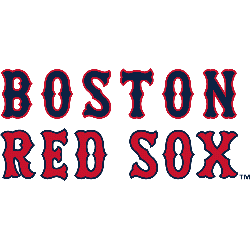
Boston Red Sox Logo History – Wordmark Logo
The Boston Red Sox wordmark logo collection celebrates the team’s iconic MLB legacy. Featuring bold red sock designs, the Boston Red Sox logo fuels team spirit. This collection highlights Boston Red Sox logo history, uniting fans with the vibrant heritage of Boston Red Sox MLB baseball. Boston Red Sox 2009 – Present The Boston Red Sox logo comprises of a …
MLB Logo – Wordmark Logos of All MLB Teams
The MLB wordmark logo collection celebrates the vibrant legacy of every Major League Baseball team. Featuring bold designs, the MLB logo unites fans across teams. This collection highlights MLB logo history, showcasing team MLB logo designs that embody the spirit of America’s favorite pastime.MLB Primary LogoMLB Alternate LogoMLB Logo BattleMLB Team HistoryArizona Diamondbacks Double lined wordmark “DIAMOND” on top and …
MLB Logo History – Every MLB Team Logos Collection
Welcome to the ultimate MLB logo showcase, featuring every MLB logo from all 30 teams. Explore the rich MLB logo history, admire the unique team MLB logo designs, and celebrate baseball’s heritage. This collection highlights the evolution of Major League Baseball’s iconic logos, perfect for fans and collectors alike.MLB Logo Collection PRIMARY See each and every team’s primary logos from …
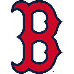
Boston Red Sox Logo History – Alternate Logo
The Boston Red Sox alternate logo collection showcases the team’s iconic MLB legacy. Featuring bold red socks and “B” designs, the Boston Red Sox logo enhances team spirit. This collection highlights Boston Red Sox logo history, uniting fans with Boston Red Sox MLB tradition. Boston Red Sox 2009 – Present The Boston Red Sox logo comprises of a pair of …
MLB Logo – Alternate Logos of All MLB Teams
The MLB logo collection showcases vibrant alternate logos for every team, embodying baseball’s rich spirit. Each team MLB logo reflects unique heritage. This collection of alternate logos highlights MLB logo history, uniting fans with the dynamic traditions of Major League Baseball’s iconic franchises.MLB Primary LogoMLB Wordmark LogoMLB Logo BattleMLB Team HistoryArizona Diamondbacks A red diamondback snake head biting on a …
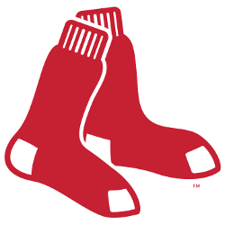
Boston Red Sox Logo History – Primary Logo
The Boston Red Sox primary logo is a timeless emblem of MLB pride. Featuring iconic red socks, the Boston Red Sox logo captures the team’s historic legacy. Its bold design unites fans, reflecting the franchise’s passion and enduring spirit in Boston Red Sox MLB games. Boston Red Sox 2009 – Present The Boston Red Sox logo comprises of a pair …
MLB Logo – Primary Logos of All MLB Teams
Welcome to the definitive MLB logo hub, showcasing the primary logos of every MLB logo across all 30 teams. Dive into the captivating MLB logo history, explore the iconic team MLB logo designs, and celebrate Major League Baseball’s rich visual legacy.MLB Alternate LogoMLB Wordmark LogoMLB Logo BattleMLB Team History Arizona Diamondbacks A Sedona Red letter “A” with black and Sonoran …