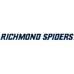
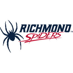
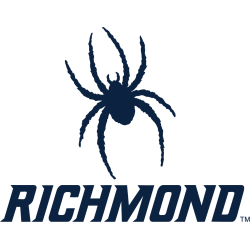
The Richmond Spiders logo history highlights every update made to the program’s visual identity, including each Richmond Spiders Wordmark logo used through the years. You will also see how different Richmond Spiders logo PNG versions helped shape the team’s modern branding style. Richmond Spiders 2017 – Present A blue silhouette of an eight-legged spider with a wordmark below “RICHMOND” in …
Richmond Spiders Logo History – Alternate Logo
The Richmond Spiders logo history includes a wide range of creative designs that appear across many Richmond Spiders logo PNG files. Each Richmond Spiders alternate logo reflects the program’s bold identity and evolving style. This page gathers every alternate mark from early layouts to modern versions, offering a complete view of how the Richmond Spiders logo history has developed over …
Richmond Spiders Logo History – Primary Logo
The Richmond Spiders logo history highlights the evolution of the team’s primary marks over the years. Fans can view each Richmond Spiders Primary logo from its earliest designs to today’s modern version. This page also includes clean Richmond Spiders logo PNG files, allowing for clear comparison. All primary logos from the start to the present are displayed for easy reference. …
Massachusetts Minutemen Logo History – Wordmark Logo
This page documents the complete Massachusetts Minutemen logo record with a focus on official wordmarks. Each UMass Minutemen wordmark logo shows consistent text-based branding across eras. Moreover, this UMass Minutemen logo history presents every wordmark used from the program’s early years through the present day. Massachusetts Minutemen 2021 – Present A large letter “U” in red with white and black …
Massachusetts Minutemen Logo History – Alternate Logo
This page documents the complete Massachusetts Minutemen logo record with a focus on alternate designs. Each UMass Minutemen Alternate logo reflects specific branding needs over time. Moreover, this UMass Minutemen logo history presents every alternate logo used from the program’s early years through the present day. Massachusetts Minutemen 2021 – Present A large letter “U” in red with white and …
Massachusetts Minutemen Logo History – Primary Logo
This page presents the complete Massachusetts Minutemen logo collection, focusing on official primary designs used by the program. Each UMass Minutemen logo reflects its era of branding. This UMass Minutemen logo history includes every primary logo displayed from the team’s early years to today. Massachusetts Minutemen 2021 – Present A large letter “U” in red with white and black trim. …
St. Joseph’s Hawks Logo History – Wordmark Logo
The St. Joseph’s Hawks logo history highlights the evolution of the team’s identity through its Wordmark designs. Each St. Joseph’s Hawks Wordmark logo captures the program’s character, while updates in St. Joseph Hawks basketball branding complement these designs. Studying the St. Joseph’s Hawks logo history provides a clear view of the team’s visual transformation over the years. St. Joseph’s Hawks …
St. Joseph’s Hawks logo History – Alternate Logo
The St. Joseph’s Hawks logo history features a wide range of creative designs used through different eras. Each St. Joseph’s Hawks alternate logo highlights the identity and spirit of St. Joseph Hawks basketball. This page brings together every alternate logo from the team’s early years to the present day. It offers a clear look at how the program’s visual style …
St. Bonaventure Bonnies Logo History – Wordmark Logo
The St. Bonaventure Bonnies logo history reflects the team’s evolving identity from early designs to modern styles. Each St. Bonaventure Bonnies Wordmark logo captures the program’s spirit, while updates to St. Bonaventure Bonnies basketball branding complement the Wordmark evolution. Explore how the St. Bonaventure Bonnies logo history showcases the team’s visual journey over time. St. Bonaventure Bonnies 2025 – Present …
St. Bonaventure Bonnies Logo History – Alternate Logo
The St. Bonaventure Bonnies logo history showcases a variety of creative designs used throughout the years. Each St. Bonaventure Bonnies alternate logo reflects the team’s evolving identity. Fans of St. Bonaventure Bonnies basketball will enjoy seeing how the logo has changed from early versions to the modern-day graphics. This page provides a complete collection of alternate logos from the start …
- Page 2 of 2
- 1
- 2


