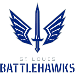
St. Louis Battlehawks
A blue, white, and silver sword with blue, white, and silver wings coming out of the sword. Wordmark “ST. LOUIS” in silver and “BATTLEHAWKS” in blue. Carried over from the XFL.
St. Louis Battlehawks
2023 - 2024
Wordmark "ST. LOUIS" in silver and "BATTLEHAWKS" in blue.
Font: Unknown

St. Louis Battlehawks
2020 - 2023
Wordmark "ST. LOUIS" and "BATTLEHAWKS" in blue.
Font: Unknown
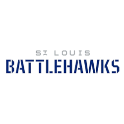
St. Louis Battlehawks Wordmark Logo
Since 2020, the St. Louis Battlehawks wordmark logo has played a central role in team branding. The design uses sharp, angular typography to suggest motion and strength. Moreover, the navy, silver, and blue palette reinforces a modern football identity. These elements form a key chapter in the broader St. Louis Battlehawks logo history.
Over time, designers introduced subtle refinements. For example, spacing between letters improved for better readability. Kerning adjustments also enhanced balance across digital and print formats. As a result, updated St. Louis Battlehawks logo PNG files display cleaner lines and stronger visual clarity on merchandise and broadcast graphics.
Meanwhile, the wordmark continues to complement the team’s main emblem. It works seamlessly with the primary branding system while maintaining its distinct typographic presence. Therefore, each revision documented here strengthens the complete St. Louis Battlehawks logo history from launch to the present day.
For a full franchise timeline, visit the St. Louis Battlehawks History page. You can also compare this typography with the main emblem on our St. Louis Battlehawks Primary Logo page.