St. Louis Battlehawks
A blue, white, and silver sword with blue, white, and silver wings coming out of the sword. Wordmark “ST. LOUIS” in silver and “BATTLEHAWKS” in blue. Carried over from the XFL.
St. Louis Battlehawks
2023 - 2024
A battlehawk's head is heading down to attach in blue, blue grey, and white.

St. Louis Battlehawks
2023 - 2024
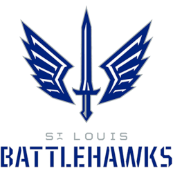
A blue, white, and silver sword with blue, white, and silver wings coming out of the blade.
New design on the wings and a new shade of blue.

St. Louis Battlehawks
2020 - 2023
A blue, white, and silver sword with blue, white and silver wings coming out of the sword.

St. Louis Battlehawks Alternate Logo
The St. Louis Battlehawks alternate logo first appeared in 2020 when the franchise joined the XFL. The original alternate design featured a stylized hawk’s head with a red, white, and blue color scheme. These patriotic tones reflected the city’s strong sports culture. This design marked an important chapter in the broader St. Louis Battlehawks logo history.
In 2021, the team refined the alternate mark after reviewing fan feedback. Designers added extended wings behind the hawk’s head to convey strength and motion. The updated structure improved balance and visibility across merchandise and digital platforms. High-resolution St. Louis Battlehawks logo PNG files clearly display the sharper outlines and enhanced symmetry introduced in this revision.
Today, the alternate logo complements the team’s primary and typography marks while maintaining a consistent identity system. Each version plays a role in the evolving St. Louis Battlehawks logo history documented on this site. For a complete franchise timeline, visit the official St. Louis Battlehawks History page. You can also compare typography elements on our St. Louis Battlehawks Wordmark Logo page.