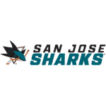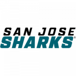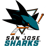
San Jose Sharks Wordmark Logo 2021 - Present
The San Jose Sharks recently revealed several versions of a new wordmark logo for their National Hockey League team prior to the start of the 2021 season. With the new release, they’ve also retired several older secondary logos that haven’t received much use lately. Here’s the scoop on exactly what has changed.
They have already begun using the new wordmark logo on their website homepage along the top header. What may appear to be simply the team’s name in a new font is actually what’s called a wordmark logo. The team unveiled their new wordmark logos this past October.
When you view the logos against a teal background (such as on their website, for example), the black lettering gives the appearance of a shadowy figure lurking beneath the ocean’s surface. The color of the lettering changes depending on what color the background of the page is. They give the example of teal, white, and black backgrounds.

San Jose Sharks Wordmark Logo 2021 - Present
In their stacked words logo, you can see that there are two different versions, each with the words “San Jose” stacked on top of the words “Sharks”. The words “San Jose” are slightly different sizes in the two versions. It’s my opinion that the first version, with “San Jose” and “Sharks” the same size, will look better in small print. The second version with “San Jose” in smaller type than “Sharks” will be used in large print.
The logo release also included wide versions of the wordmark logos in different colors on different colored backgrounds.
The new wordmark logos all have sharp corners and edges, reminiscent of sharp shark’s teeth. You can see the comparison to the older wordmark logos from 2007 that they’ve officially retired now. Those had much softer rounded edges. Although it’s a slight difference, when you see them side by side it’s noticeable.
The Sharks made one minor change to a secondary logo featuring the initials “SJ” with a small shark fin image in a diamond. The only change was to remove the gradient teal color of the waves in the diamond with a solid teal. Other than that minor change, the secondary “SJ” logo remained the same.

San Jose Sharks Wordmark Logo 2021 - Present
It’s worth noting that they have removed nearly all of the orange from all of their logos. It seems clear that the team is moving away from the orange as their secondary team color.
There you have it, a summary of the changes that the San Jose Sharks have made to their wordmark logos ahead of the 2021 season. Do you like the changes? Can you tell the differences? Is there something else you would have changed?
See the San Jose Sharks logo history and team history.
___
Sports Logo History is a vibrant community of sports logo enthusiasts who share a deep appreciation for the captivating histories behind each team's logo. We take pleasure in exploring the evolution of primary logos, alternate logos, and wordmark logos from renowned leagues such as the NFL, NBA, MLB, MLS, NHL, Premier League, WNBA, CFL, NCAA, UFL, ABA, USFL, AAF, and XFL. Immerse yourself in the intricate details and stories behind these iconic symbols that represent the essence of each team.
In the enthralling realm of sports, the battle of logos among different leagues unfolds as a captivating and ongoing spectacle. Step into the world of Sports Logo History, where we showcase the relentless pursuit of distinction by leagues such as the NFL, NBA, MLB, Premier League, and countless others. Witness the captivating journey as each league strives to create logos that not only capture the essence of their sport but also resonate deeply with fans.
Immerse yourself in the comprehensive sports history provided by Sports Team History, our esteemed partner site, where you can discover the triumphs, challenges, and defining moments that have shaped the legacies of professional sports teams. Stay up to date with the latest sports news through Sports News History, a platform delivering 24/7 coverage of highlights, player interviews, and game analyses. Additionally, express your unwavering support for your favorite teams by exploring Sports Store History, the premier sports team marketplace offering a vast selection of jerseys, memorabilia, and collectibles. Join our community today and celebrate the rich history, iconic logos, and passion of sports.

