Houston Roughnecks
A red with blue trim letter “H” with a white with blue trim stare on top of the letter “H.” Wordmark “HOUSTON” in red and “ROUGHNECKS” in blue. Carried over from the XFL with a new shade of red.
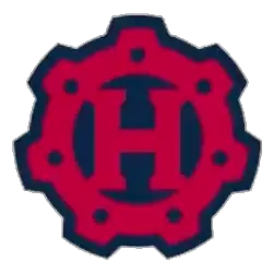
Houston Roughnecks
2023 - 2024
A red and blue gear with the letter "H" inside the gear.
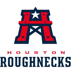
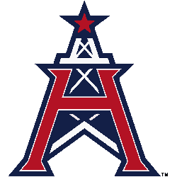
Houston Roughnecks
2020 - 2023
A red with white trim on a blue formed background letter "H" in front of a blue and white oil rig with a red and blue star on top of the oil rig.
Houston Roughnecks Alternate Logo
The early Houston Roughnecks alternate logo featured two crossed footballs placed beside the team name in strong white lettering. This design was used during the franchise’s earlier era and helped establish visual recognition. The layout emphasized toughness and energy, which aligned with the Roughnecks identity. These early versions form an important chapter in the overall Houston Roughnecks logo history.
When the league relaunched in 2019, the team introduced a refreshed Houston Roughnecks alternate logo. Designers preserved familiar elements while modernizing the typography and color palette. The updated look maintained brand continuity but added sharper lines and stronger contrast. High-resolution Houston Roughnecks logo PNG files display these refinements clearly across digital and merchandise platforms.
Today, the alternate branding complements the primary emblem and wordmark. The evolution seen throughout the Houston Roughnecks logo history reflects a balance between tradition and modernization. For a complete franchise timeline, visit the Houston Roughnecks History page. To compare typography and branding elements, explore the Houston Roughnecks Wordmark Logo page for additional team design insights.