Houston Roughnecks
2024 - Present
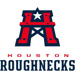
A red with blue trim letter “H” with a white with blue trim stare on top of the letter “H.” Wordmark “HOUSTON” in red and “ROUGHNECKS” in blue. Carried over from the XFL with a new shade of red.
Roughnecks Wordmark Logo
The Houston Roughnecks are a professional football team in the XFL, and their wordmark logo has been around since its inception, alongside the Houston Roughnecks Primary logo. The logo consists of an orange-and-white shield with the words “Houston Roughnecks” written across it. This design was chosen to represent the toughness and resilience of Houstonians, as well as to honor their city's rich history in sports.
The original version of this logo featured a white star at its center, which is meant to symbolize Texas' pride and spirit; however, this element was removed when the team rebranded ahead of its inaugural season in 2020 due to copyright concerns from other teams using similar designs. Instead, they adopted two crossed swords behind their shield that were inspired by Texas' state flag - further emphasizing how much they value being part of such an iconic region within America.
Ultimately though what makes this particular wordmark so special is that it speaks directly to those who have supported them from day one: fans who live for football but also appreciate all things Texan! It captures both aspects perfectly while still remaining visually striking enough for people unfamiliar with either concept – making sure everyone knows exactly where these proud Texans come from!
Houston Roughnecks
2023 - 2024
Wordmark "HOUSTON" in red and "ROUGHNECKS" in blue.
Font: Houston Roughnecks
https://font.download/font/houston-3
Houston Roughnecks
2020 - 2023
Wordmark "HOUSTON" in blue and "ROUGHNECKS" in red.
Font: Houston Roughnecks
https://font.download/font/houston-3


