Logos, where sports teams are concerned, are of huge significance and importance. And what is often the case is that logos change slightly over the years, but they retain most of their important features, ensuring the past and what has gone before are never forgotten. A prime example of this is how the Washington Wizard’s logo has changed over time.
The Washington Wizards are one of the most prominent and recognizable teams in the NBA for anyone who doesn't know. They’re a basketball team that is incredibly popular, which is why they have so many fans. And many of these fans go the extra mile by watching the team play and by including them in any number of basketball betting markets online. These fans also appreciate the team's rich history and, more specifically, the logo.
 Sports Logo History
 Chicago Packers Primary Logo 1962
Going way back to 1962, the first ever logo was actually a basketball in the traditional color of orange. The lines you’d expect to see on a basketball were there, and then there was a bull’s head front and center to complete the simple but effective look. A year later, in 1963, however, this logo was replaced by one that displayed the word Zephyrs after the team’s new name, which became a common theme.

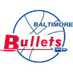
Baltimore Bullets Primary Logo 1964 - 1969
In the main, the logo was the word Bullets with two arms taking on the role of the letter Ls and reaching for a basketball. It became synonymous with the franchise, and things only changed again when the Bullets became the Wizards, which they have been since 1997. The good news is that the logo has only changed once since, which is sure to have pleased fans who enjoy the stability.
 Sports Logo History
 Washington Bullets Primary Logo 1975 - 1987
How the logo looks now makes a lot of sense, considering that it represents the color of the team’s uniform. When you look back, not only has the team, in terms of its name, been on somewhat of a journey but so has the logo. It’s never really been out there as unique and awe-inspiring, but there was the abstract phase. You could say there’s been a desire to remain uniform in the approach to the design, sticking to the status quo of sorts, which is what the current logo reflects.
Sports Logo History is a community of sports logo enthusiast who enjoys the history of each team’s logo history. Sports Logo History has primary logos, alternate logos, or wordmark logos from the NFL, NBA, MLB, MLS, NHL, Premier League, WNBA, CFL, NCAA, ABA, USFL, AAF, and XFL.
One of our partner sites Sports Team History takes a look at the history of each and every professional sports team. In addition, we have added Sports News History to our sports history websites. 24/7 non-stop sports news that's worth knowing. Finally, the premier sports team marketplace for your favorite team or college with thousands of items for you to peruse at Sports Market History.

