SPORTS LOGO HISTORY

Sports Logo HistorySports Logo History
  • Logos Type
    • Alternate Logo History
    • Primary Logo History
    • Wordmark Logo History
  • League Logos
    • AAF Logo History
    • ABA Logo History
    • CFL Logo History
    • College Logo History
    • MLB Logo History
    • MLS Logo History
    • NBA Logo History
    • NFL Logo History
    • NHL Logo History
    • NWSL Logo History
    • Premier Logo History
    • UFL Logo History
    • USFL Logo History
    • WNBA Logo History
    • XFL Logo History
  • Logo Battle
  • Logo News
  • More…
    • Logo Videos
      • MLB Sports Videos
      • NBA Sports Videos
      • NCAA Sports Videos
      • NHL Sports Videos
      • NFL Sports Videos
      • Soccer Sports Videos
    • SHG YouTube Channel
    • Sports Team History
    • Sports News History
    • Sports Store History
    • Sports Logo History Products

Generic selectors
Exact matches only
Search in title
Search in content
Post Type Selectors
Search in posts
Search in pages

Generic selectors
Exact matches only
Search in title
Search in content
Post Type Selectors
Search in posts
Search in pages
SLH News - Ranking Broncos Logo

Denver Broncos Logo Evolution: Ranking 60 Years of Mile-High Identity

When you think of the Denver Broncos, what comes to mind? For many fans, it’s not just the roaring stallion or the signature orange and blue, it’s the legacy. One of the most recognizable franchises in the NFL, the Broncos have undergone several logo transformations over the decades. Some were fierce. Others, frankly, forgettable. But every version tells part of the story. Here’s a look back, ranked from the most iconic to the least inspired.

  1. The Modern “Charging Horse” (1997–Present)
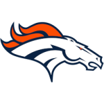
Denver Broncos Primary Logo 2002 - Present
It was a bold move in 1997. The team ditched its longtime look in favor of a streamlined, aggressive stallion, poised as if charging straight into battle. At the time, some questioned the odds of fans embracing such a radical redesign. But this one stuck, and hard. Its sharp angles and fierce eye brought a sense of speed and strength that matched Denver’s back-to-back Super Bowl wins. Even decades later, it still looks fresh and powerful. It represents confidence, forward momentum, and the kind of ambition you want leading a franchise.

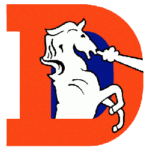
  1. The Classic “D-Horse” (1968–1996)

Denver Broncos Primary Logo 1993 - 1996Ask any old-school Broncos fan, and they’ll wax poetic about this one. The big orange “D” with a snorting white horse bursting through? Pure nostalgia. It may not look intimidating by today’s standards, but it had character, and it stuck around for nearly three decades. This emblem became the face of a team growing into its identity. It was the visual for Elway’s early years and countless memorable moments. There’s a warmth in how retro it feels now.

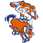
  1. The 1962–1969 Bucking Bronco

Denver Broncos Primary Logo 1962 - 1969Before the “D-Horse,” Denver flirted with a full-horse depiction, more Western, less polished. This version looked like it galloped straight off a rodeo flyer. There’s something charming about how rough it felt, but it lacked the energy and precision of its successors. Still, it reflected a team trying to root itself in local culture, making the most of a shoestring identity.

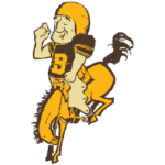
  1. The 1960–1961 Cowboy Bronco

Denver Broncos Primary Logo 1960 - 1961Let’s be honest: the original logo wasn’t great. A yellow bucking bronco with a football-tossing cowboy wearing chaps? It was cartoonish and cluttered. But it holds historical value and it was Denver’s very first identity in the AFL. That counts for something, even if design-wise it was all over the place. It had a wild, offbeat charm that feels more like a collector’s patch than a pro team emblem.

The Forgotten Footnote (1962, Unused Variant)

Not many people know about this brief design direction. Rumored to have existed only in internal drafts, this version leaned heavily on Western themes but never made it to game day. Think sepia tones and spurs, more of a branding concept than a real logo. It’s more of a forgotten piece of Broncos history than a true emblem. Still, it's a fun reminder of how branding almost went in a completely different direction.

Wrap Up

The Denver Broncos’ logos mirror the team’s growth, from underdogs to a franchise known for grit and glory. While design trends have changed, each logo left a mark on fans and players alike. Whether you cheer for the modern stallion or still hold a soft spot for the old “D,” there’s no denying the visual evolution has been part of the team’s story.

The Sports History Network

Explore the evolution of iconic team branding and professional sports legacies across our entire network at the Sports History Group.

Dive deeper into franchise legacies at Sports Team History, catch real-time highlights via Sports News History, or shop for authentic collectibles at Sports Store History.

1960 Denver Broncos cowboy1997 Broncos logoBroncos brand identityBroncos D-Horse logoBroncos logo evolutionClassic Broncos emblemdenver broncos logo historyDenver Broncos logo timelineDenver Broncos logos rankedMile-High logo changesModern Broncos stallionOriginal Broncos logoVintage Broncos logos

Sports Logo History Newsletter

Sign up for our newsletter to get the latest sports logo updates delivered directly to your inbox!

Sports History Group Videos

Sports History Group Videos

Sports News History

Sports News Worth Knowing

RSS Headline News

  • LAKERS vs SPURS | CALIFORNIA CLASSIC | FULL GAME HIGHLIGHTS | July 6, 2026
  • This just changed the NHL forever
  • DODGERS vs. ATHLETICS: Official Full Game Highlights (July 1) | 2026 MLB Season
  • FULL NFL LIVE | Lamar lead Ravens AFC title? Chris Johnson future? Cowboys wins Super Bowl?
  • FULL INCIDENT Sophie Cunningham pointing, Caitlin Clark throat punch by Alyssa Thomas

Advertisement

Sports Market History

Sports Team Marketplace of Champions!

SLH News

"Latest Sports Logo History News"

How Has the Oregon Ducks Logo Changed Over the Years?

July 8, 2026

A Brief History of the Wisconsin Badgers Logos

July 8, 2026

UCLA Bruins Logo History: Ranking Every Era from Bottom to Top

July 8, 2026

The Golden Era of Sports Logo Design: What Made 1970s–1990s Logos So Memorable

July 6, 2026

History of the NBA’s Top Team Logos

July 3, 2026

Chelsea FC Quietly Debuts Simplified 2026 Crest: A Return to Minimalist Heritage

July 1, 2026

MLB Fan Favorites: The Most Beloved Throwback Logos in Sports History

June 30, 2026

SLH Prodcut Sale

Advertisement

Generic selectors
Exact matches only
Search in title
Search in content
Post Type Selectors
Search in posts
Search in pages

Sports Logo News

How Has the Oregon Ducks Logo Changed Over the Years?

July 8, 2026

A Brief History of the Wisconsin Badgers Logos

July 8, 2026

UCLA Bruins Logo History: Ranking Every Era from Bottom to Top

July 8, 2026

The Golden Era of Sports Logo Design: What Made 1970s–1990s Logos So Memorable

July 6, 2026

History of the NBA’s Top Team Logos

July 3, 2026

Chelsea FC Quietly Debuts Simplified 2026 Crest: A Return to Minimalist Heritage

July 1, 2026

MLB Fan Favorites: The Most Beloved Throwback Logos in Sports History

June 30, 2026

The Most Famous Pirate-Themed Sports Teams in the World

June 24, 2026

When Baseball Teams Share a Name: The Strange History of the Cardinals Trademark Dispute

June 16, 2026

Fresh Identity: Unveiling the 2026 Minnesota Timberwolves Logo

June 9, 2026

Identity Crisis: The Worst NCAA Logo Redesigns That Betrayed College Traditions

May 27, 2026

Contrasting Fortunes: The Rams and Chargers Since Relocating to Los Angeles and Updating Their Logos

May 25, 2026

Sports Logo Videos

Minnesota Wild Logo

The Minnesota Wild Logo Evolution: From Concept to Icon!

Angeles Chargers Logo

Los Angeles Chargers Logo Evolution: The Boldest Designs Yet

Cleveland Cavaliers Logo History

Did The Cleveland Cavaliers Ever Have The BEST Logo in Basketball?

Green Bay Packers Logo

Which Green Bay Packers Logo Is the Greatest? A Design Journey

Best Bengals Logo

What’s the Best Bengals Logo of All Time?

Brooklyn Nets Logo Evolution

Brooklyn Nets Logo Evolution That Will SHOCK You!

Las Vegas Raiders Logo History

Discovered the HIDDEN MEANING Behind the LV Raiders Logo

Alabama Crimson Tide Logo History

How Alabama’s Logo Became a CULTURAL ICON

UCLA Bruins Logo

UCLA Bruins Logo History Revealed: Jaw-Dropping!

Arizona Cardinals Logo History

Why the Arizona Cardinals Have the Coolest Logo in the NFL

Pittsburgh Pirates Logo History

100-Year Evolution of the Pittsburgh Pirates Logo Revealed!

Manchester United Logo History

5 Iconic Logo Designs That Changed Manchester United!

Sports Store History Logo
Sports Team History Logo
Sports News History Logo
Sports Store History Logo


Sports Logo History Logo

"It's not all about the Team, It's about the LOGO."


  • About
  • Contact Us
  • Disclaimer
  • Privacy Policy
© 2013 - 2026 - Sports History Group LLC - All Rights Reserved
  • Logos Type
    • Alternate Logo History
    • Primary Logo History
    • Wordmark Logo History
  • League Logos
    • AAF Logo History
    • ABA Logo History
    • CFL Logo History
    • College Logo History
    • MLB Logo History
    • MLS Logo History
    • NBA Logo History
    • NFL Logo History
    • NHL Logo History
    • NWSL Logo History
    • Premier Logo History
    • UFL Logo History
    • USFL Logo History
    • WNBA Logo History
    • XFL Logo History
  • Logo Battle
  • Logo News
  • More…
    • Logo Videos
      • MLB Sports Videos
      • NBA Sports Videos
      • NCAA Sports Videos
      • NHL Sports Videos
      • NFL Sports Videos
      • Soccer Sports Videos
    • SHG YouTube Channel
    • Sports Team History
    • Sports News History
    • Sports Store History
    • Sports Logo History Products

Subscribe to Our YouTube Channel
We use cookies to ensure that we give you the best experience on our website. If you continue to use this site we will assume that you are happy with it.