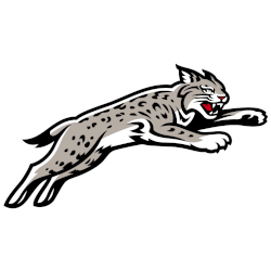
Davidson Wildcats
A leaping full-body wildcat logo in red, gray, black, and white.
Red was changed to a deeper shade.
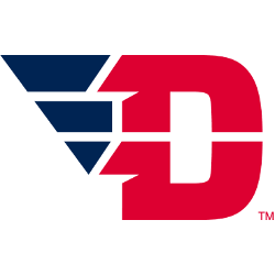
Dayton Flyers
The letter "D" in red with a blue wing coming off the letter.
Former primary logo in 2014.
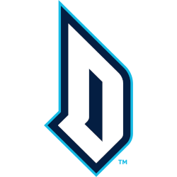
Duquesne Dukes
3-color monogram letter "D" in white, navy, and electric blue.
Duquesne partnered with Change Up for the brand design unveiled in May 2019 and included feedback from Duquesne's athletics apparel partner, Nike. Rooted in the heritage of the University and the city of Pittsburgh...
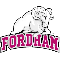
Fordham Rams
A grey, white and black ram leaping over a wordmark "FORDHAM" in red with white and black trim.
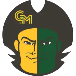
George Mason Patriots
A Patriot's face wearing a black tricorn with the initials "GM" on the right side the closed smiling face is split in half with gold on its right side and green on its left side.
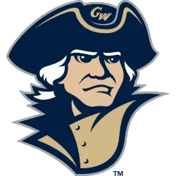
George Washington Colonials
A front view of a blue, gold, and white colonial wearing a blue and gold hat with the initials "GW."
A new shade of blue and gold.
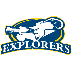
La Salle Explorers
A white with blue highlights explorer with a spyglass in a blue with yellow trim oval above a wordmark "EXPLORERS" in white all on a blue background.
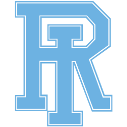
Rhode Island Rams
Interlocked letters "RI" in light blue with white and blue trim. The letters "RI" represent the state of Rhode Island.
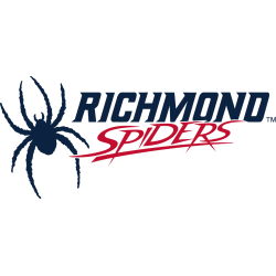
Richmond Spiders
A blue eight legged spider next to a wordmark "RICHMOND" in blue with red trim and "SPIDERS" in a custom red font.
A new shade of blue and red.
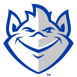
Saint Louis Billikens
A front view of a white and grey with the blue trim troll.
A former primary logo.
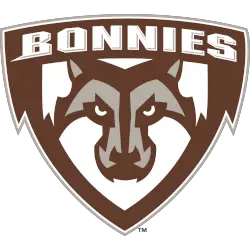
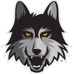
St. Bonaventure Bonnies
A brown, grey and white wolf's head on a brown shield with a wordmark "BONNIES" in white.
Beige was removed and another outline in gray was added.
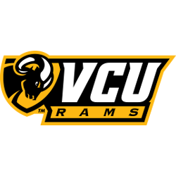
Virginia Commonwealth Rams
A yellow and black shield with a side view of a black and white ram's head next to initials "VCU" in white and "RAMS" in black on a yellow background.
Atlantic 10 Conference Logo History
The Atlantic 10 Conference alternate logos originally featured simple lettering and classic design elements. Over time, updates included bolder colors and sharper shapes, reflecting key points in the Atlantic 10 Conference logo history. For more details about the member schools, visit the official Atlantic 10 Wikipedia page.
Modern alternate logos focus on cleaner lines and dynamic elements, enhancing recognition across digital and print formats. Each Atlantic 10 Conference alternate logo represents a member of the Atlantic 10 Conference teams, helping fans identify their favorite schools more easily. For variations, check the Atlantic 10 Conference Wordmark logo page on our website.
Today’s alternate logos maintain strong typography and updated color schemes that reflect the conference’s identity. The Atlantic 10 Conference logo history shows a steady evolution toward clarity and brand consistency. Viewing these designs allows fans to track how each Atlantic 10 Conference alternate logo has developed over time.