
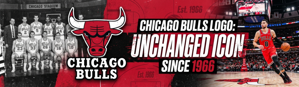
The Chicago Bulls logo has had almost sixty years to look dated. It still does not. The red bull head, sharp horns, and heavy black lines work because the mark says the team name before a person reads one word.
A small digital check before the real game
Modern basketball fans often build a game night from several screens. They may check the schedule, player availability, live stats, ticket details and pre-game coverage before the arena doors open. That habit is part of today’s fan routine, even when the team’s identity comes from a much older design world.
1xBet Malaysia presents itself as a betting site with sports lines, live markets and account access in one place. Fans who use services in that category usually check them before the game, then move back to the match, the broadcast, or the arena experience. The Bulls logo has stayed the same, but the way fans consume basketball around it has changed a lot. People now follow the team through highlights, social media, live reactions, and constant updates, not just the game itself.
The name gave the logo a clean job
The Bulls arrived for the 1966-67 NBA season. The official Chicago Bulls team history dates the franchise to 1966, when Chicago already understood tough, physical sports branding. The nickname also had local weight: for decades, the city had been tied to stockyards, meatpacking and the image of a working industrial place. The old Union Stock Yards had shaped the city’s industrial image for decades. A bull did not need a long explanation in that setting.
That matters for a sports logo. The best team marks can survive on a cap, a ticket stub, a broadcast graphic or a child’s poster. The Bulls mark had that from the beginning: one animal, one expression, one color story.
The face does most of the work
The logo does not show a full animal. That decision keeps it tight. A full bull could have looked busy, especially on a small jersey patch or a scoreboard graphic.
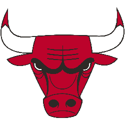
The face carries the emotion. The lowered brows give the bull its glare. The nostrils add pressure without adding clutter. The white horns cut through the red head and keep the shape readable from a distance. A few choices make the design unusually durable:
- The red is bold enough to read quickly.
- The black outline gives the head weight.
- The white horns keep the top of the logo clean.
- The eyes create an attitude without extra detail.
- The lettering sits above the face without fighting it.
That mix gives the logo a strong silhouette. Cover the words, and the bull still reads. Shrink it down, and the horns still hold the shape together.
A weaker version would have added more muscle, motion lines, a body, or a basketball. The Bulls logo avoids that load. It trusts the head and the stare.
It works because it is easy to place
A logo lives on awkward surfaces. It has to sit on shorts, center court, warm-up gear, old TV footage, mobile screens and souvenir cups. The Bulls mark handles those jobs because the core shape stays clear.
On a white jersey, the red head stands out fast. On black merchandise, the horns and outline keep the mark from disappearing. On a tiny phone screen, the face still reads as a bull because the design uses large parts instead of fussy ones.
That is one reason the logo did not need constant repair. It already had enough contrast. It already had a strong front-facing shape. It already looked like a sports mark without needing extra noise around it.
The wordmark also helps. “Chicago Bulls” sits in firm lettering above the head, but the animal remains the main act. People remember the face first, then the name.
Jordan made it worldwide, but did not create its strength
Jordan’s six-title run made the bull head travel far beyond Chicago. During the Jordan years, the bull head moved far outside Chicago. People wore it on caps, jerseys, and cheap market T-shirts even if they barely followed the NBA. By 1991, the logo was already 25 years old.
The 1990s gave the logo historic weight. They did not have to fix the design. That is the important part. When the team became a global name, the identity was already ready for that pressure.
A weaker logo might have looked trapped in its original decade once the team grew bigger. The Bulls mark looked at home on national broadcasts, championship merchandise and streetwear because it was already simple enough to travel.
The logo has no spare parts
The Bulls mark has very little to date it. No shine, no extra mascot, no clever second image hiding inside the shape. It is just the head, the horns, the eyes and the team name.
That is why it still works on a playoff graphic, an old jacket, a court decal or a plain black T-shirt. A fan can look at a photo from the Jordan years and recognize almost the same logo used today.
A logo that still earns its place
The Chicago Bulls logo stayed because it solved the problem early. It linked the team name to a clear image, gave Chicago a hard-edged basketball identity, and left enough space for history to build around it.
The design is not quiet. It is just disciplined. Red head, black lines, white horns, fixed stare. That is enough.
After nearly six decades, the logo still works on a jersey, a screen, and a street-corner cap. The Bulls have changed players, arenas, seasons and eras. The bull head has stayed because it still says everything quickly.