
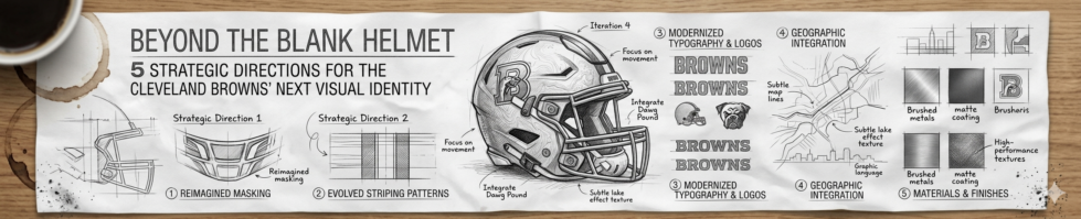
The Identity Crisis: Why the Browns Helmet is (and isn’t) a Logo
In professional sports branding, standing out usually means adding more. The Cleveland Browns did the opposite — and it worked. For nearly eight decades, the franchise has fielded one of the NFL’s most recognizable symbols without a single mark on it. That blank orange helmet is the logo, and understanding why reveals everything about why a Cleveland Browns logo redesign conversation is both inevitable and genuinely complicated.
The Browns franchise is valued at approximately $5.15 billion as of 2024 — an 11% year-over-year increase — despite being the only NFL team without a traditional helmet logo. (DesignRush)
Then vs. Now
| Era | Brand Strategy | Fan Sentiment |
|---|---|---|
| 1946–1990s | Minimalism as identity; helmet = grit | Pride in simplicity |
| 2000s–2015 | Minor tweaks, alternate logo introduced | Growing restlessness |
| 2020s | “Helmetogo” movement gains momentum | Split between tradition and evolution |
The “Helmetogo” phenomenon — a viral groundswell of fan-driven concepts imagining what a primary mark could look like — signals real market tension. Simple, color-centric logos like the Browns’ orange helmet are 70% more likely to be remembered than complex illustrations, which means Cleveland’s minimalism has measurable power. Abandoning it carelessly would be a serious brand mistake.
However, a blank helmet can’t anchor merchandise lines, digital avatars, or motion graphics the way a true primary mark can. That’s the central conflict: honoring a bold, intentional tradition while building an identity system fit for modern platforms.
One answer may already be hiding in the franchise’s own history — and it has pointy ears.
The Heritage Play: Reinstating ‘Brownie the Elf’ as the Primary Anchor
While the blank helmet argument is compelling, it sidesteps a deeper question: what should the Browns’ visual identity say? One answer has been sitting in the archive since 1946 — and Cleveland fans have already voted with their hearts.
The Origin
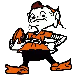
Brownie the Elf debuted alongside the franchise itself, designed as a mischievous, winking imp perched on a football helmet. The character was deliberately playful — a sharp contrast to the “tough guy” snarling wolf or bull imagery that dominates NFL branding. That differentiation is a strategic asset, not a weakness. In a league full of predators and warriors, a clever trickster is genuinely memorable.
The Exile
The elf’s disappearance is largely attributed to founder Paul Brown,, who reportedly found the character too whimsical for a franchise he wanted taken seriously. As the team’s identity hardened around the iconic orange helmet throughout the 1960s and beyond, Brownie faded to sideline merchandise and nostalgia pins. Decades passed. New fans barely knew he existed.
The Return
That changed dramatically in 2022, when Brownie the Elf won a fan vote in 2022 to claim the midfield logo — his first primary on-field appearance in decades, according to Sports Illustrated. The reaction was immediate and emotional. A franchise’s truest identity doesn’t disappear; it waits.
The strategic play now is modernization without sanitization. A redesigned Brownie built for digital platforms — bold linework, scalable geometry, enough attitude to hold its own next to the Cleveland Browns Dawg Pound logo culture — could anchor everything from helmet decals to TikTok animations. Keep the mischief. Update the execution.
That tension between honoring history and demanding contemporary relevance is exactly what makes the next design conversation so charged — especially when Cleveland’s most passionate fans are already driving it themselves.
The Modern Bite: The 2023 Bullmastiff and the Dawg Pound Evolution
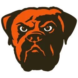
If Brownie the Elf represents the Browns’ soul, the 2023 Bullmastiff logo — designed by Houston Mark — represents its teeth. And the details buried inside that design tell you exactly why fan-led creative direction is the only path forward for this franchise.
The Easter Eggs Worth Knowing
The Cleveland Browns’ official reveal confirmed that this wasn’t just a dog drawing. Every element earns its place:
- The nose shaped like a football — a quiet nod to the sport itself, embedded so naturally most fans miss it on first glance
- The jowls outlining the Hope Memorial Bridge — Cleveland’s Art Deco landmark rendered in fur and shadow
- 8 spikes on the collar — representing the eight divisions of the NFL, grounding a regional symbol in the league’s broader structure
- The Brownie the Elf logo lineage — a spiritual inheritance from the franchise’s original mascot, linking past identity to present attitude
This level of layered storytelling is rare in sports branding. It rewards attention.
Why the City Demands a Seat at the Table
The Dawg Pound isn’t a fan section — it’s a governing body with veto power. As Browns EVP JW Johnson put it directly: “Our fans have been asking us for a new dawg logo for quite some time, so it made perfect sense for them to select the logo themselves.” That’s not fan service. That’s smart organizational strategy.
In practice, Cleveland’s identity is inseparable from its community ownership. Any top-down rebrand without genuine fan input risks the kind of backlash that lingers for decades.
The Youth Engagement Signal
The Bullmastiff is already outperforming the plain helmet where it matters most — with younger fans. The dog has a face, an attitude, and story hooks that work on merchandise, social media thumbnails, and gaming platforms in ways an orange helmet simply can’t compete with.
That social energy, though, hasn’t stayed within official channels — and some of the most compelling redesign concepts are emerging somewhere the front office didn’t plan for.
The ‘Chef Zae’ Effect: Why Social Media is Winning the Redesign War
The most compelling Cleveland Browns helmet logo ideas aren’t coming from design agencies — they’re coming from fans with laptops and a serious opinion. Social media has become the unofficial R&D department for Cleveland’s visual identity, and the volume of creative output is impossible to ignore.
Fan-generated redesigns are no longer a sideshow — they’re a real-time focus group that the Browns would be foolish to overlook.
Fan Concept Spotlight: Chef Zae’s Viral Redesign
Chef Zae’s Croc Pot concept video became a primary touchpoint for fans debating the “helmetgo” redesign across Facebook and Instagram, sparking thousands of comments and reshares. The concept’s success wasn’t accidental — it synthesized everything fans have been arguing about for years into a single, watchable format.
The 3 Dominant Fan Design Camps
What’s emerged from the noise is a clear ideological split:
- The ‘B’ Monogram Camp — — Wants a clean, wordmark-style letterform for modern merchandise appeal
- The Dawg/Bullmastiff Camp — — Leans into the Dawg Pound legacy with aggressive canine imagery
- The Brownie the Elf Camp — — Pushes heritage restoration as the only authentic path forward
The Ohio-Shaped Ear: A Recurring Breakout Element
One detail keeps reappearing across independent fan submissions: an Ohio-shaped ear integrated into dog or elf silhouettes. It’s clever, geographic, and distinctly Cleveland. In practice, design elements that root a team in place rather than just sport tend to generate the strongest emotional response from fan communities.
This kind of UGC momentum is valuable data — and translating it into an official framework requires a set of firm design rules. That’s exactly what the next section addresses.
Strategic Blueprint: 4 Must-Haves for a New Cleveland Primary Logo
The fan concepts, the Bullmastiff designs, the social media groundswell — all of it points toward one question: what are the non-negotiables? Whether it’s a professional rebrand or a new browns logo fan vote initiative, any serious contender for the Browns’ primary mark needs to pass four tests. These aren’t arbitrary preferences. They’re guardrails built from the team’s history, geography, and identity.
Rule 1: Honor the 8 Championships
The eight spikes on the 2023 Bullmastiff logo’s collar aren’t decorative — according to the Cleveland Browns’ official site, each spike represents one of the team’s eight total championships. That’s a design choice with real historical weight, and any future primary logo should carry that same accountability.
- Must include a deliberate, legible reference to the number eight
- Avoid burying the tribute in obscure details fans can’t decode at a glance
Rule 2: Root It in Geography
Cleveland isn’t a generic market. The Ohio shape, the Hope Memorial Bridge, Lake Erie’s shoreline — these are visual anchors that signal place. A logo stripped of geography is a logo that could belong to anyone.
- Must incorporate at least one recognizable Cleveland or Ohio visual cue
- Avoid generic animal silhouettes with no geographic grounding
Rule 3: Protect the Color Code
Burnt orange and seal brown are non-negotiable. As Cleveland Magazine notes, the helmet’s color identity is arguably the franchise’s most recognized asset globally. Dilute it with trendy neutrals or alternate palettes and you’ve broken the covenant.
- Must use the exact established hex values for both primary colors
- Avoid gradient treatments or “modernized” tonal shifts that soften the palette
Rule 4: The Helmet-Free Mandate
The blank orange helmet is sacred equipment — it is not, and should never become, the primary logo. A logo represents the team’s identity across every medium: jerseys, merchandise, digital platforms, stadium signage. Equipment is contextual. Identity is universal.
- Must function independently of any helmet imagery
- Avoid designs that lean on the helmet as a visual crutch
Get these four rules right, and the foundation is solid. The harder question — which direction the Browns actually commit to — is exactly where the conversation needs to go next.
Key Takeaways
- The nose shaped like a football — a quiet nod to the sport itself, embedded so naturally most fans miss it on first glance
- The jowls outlining the Hope Memorial Bridge — Cleveland’s Art Deco landmark rendered in fur and shadow
- 8 spikes on the collar — representing the eight divisions of the NFL, grounding a regional symbol in the league’s broader structure
- The Brownie the Elf logo lineage — a spiritual inheritance from the franchise’s original mascot, linking past identity to present attitude
- The ‘B’ Monogram Camp — — Wants a clean, wordmark-style letterform for modern merchandise appeal
Conclusion: The Future of the Orange Helmet
The blank helmet stays. That’s the verdict — and it’s non-negotiable. As Cleveland Magazine’s deep dive into helmet history makes clear, that unadorned orange shell isn’t an absence of identity; it is the identity. Protecting it honors decades of Cleveland toughness.
But “protect the helmet” doesn’t mean “protect the status quo everywhere else.” The primary logo — the mark that lives on merchandise, digital platforms, and broadcast graphics — is overdue for a transformation. The strategic blueprint is already visible: a dual-threat identity built around Brownie the Elf and a modern Bullmastiff mark, working together the way a great offense and defense do.
Fan momentum is real. The social media groundswell around Cleveland Browns helmet logo ideas proves the Dawg Pound isn’t waiting for permission. Keep submitting concepts. Keep pushing the conversation.
The next five years of Browns branding belong to the fans bold enough to imagine them.
Final Verdict: Keep the helmet blank — forever. Redesign everything else with purpose. A Brownie-plus-Bullmastiff dual identity gives Cleveland a legacy anchor and a forward-looking symbol that can carry the franchise for the next 50 years.