

There are not many team logos that have endured the test of time. Almost every franchise, team, and club has undergone changes or modifications to its logo over time. The Atlanta Falcons are a professional football team in the NFL. You may be surprised to learn that the Atlanta Falcons have yet to win a championship, but they have a rich history in the sports world. The team's unique logo embodies various attributes, including strength, speed, and energy. The logo features a streaking falcon with talons at the road.
The Philadelphia Eagles logo is also similar to this one, but some differences make the Atlanta Falcons logo one of the best. What are the unique features of the logo that make it so popular among fans? Is it about the color scheme of the logo or the sleek design? Despite the team's bad luck in the National Football League, this logo keeps Atlanta Falcons fans hooked. For a fan, it is vital to know the history of the logo and how it has remained consistent over the years.
History of the Atlanta Falcons Logo
Atlanta City enjoyed its first football match in 1962 when the American Football League decided to conduct two preseason exhibition matches. This was an exciting event for the locals, and soon after this exhibition, AFL returned to the city with other matches in 1964. After one year of these thrilling matches, Atlanta built its football stadium in 1965. The city had negotiated with the AFL and secured its franchise.
The AFL and NFL had disputes at that time, and NFL management held discussions with city officials to decide between the AFL and the NFL. Finally, in 1966, the Atlanta Falcons became the 15th team of the National Football League. In 1989, locals suggested different logos for the team, and the franchise chose the best one. The official logo of the team featured a basic, geometric-like design of a falcon in flight. What are other factors that make this logo so special for the fans and the franchise? Let’s take a look at some distinct features of the logo.
Unique Design
The design of the logo is memorable for any fan or simple football lover. The distinct design of an aggressive-looking and fierce falcon represents the determination, strength, and other qualities of the team. All sports teams want to showcase these qualities in every aspect. Sports lovers want to know every little detail about their favorite teams.
The design of the logo is memorable for any fan or simple football lover. The distinct design of an aggressive-looking and fierce falcon represents the determination, strength, and other qualities of the team. All sports teams want to showcase these qualities in every aspect. Sports lovers want to know every little detail about their favorite teams. The rise of iGaming platforms, as recommended by https://gry-hazardowe-zadarmo.com/aplikacja-online-kasyno/, has also made it essential for players to be aware of deep facts and insights about sports teams and their history.
City Pride
The Atlanta Falcons are not just a random sports logo but a symbol of civic pride. The city has undergone significant developments over time, but Falcon has always been a pivotal part of its history. The team has represented the city at the national level, so Falcon has become more critical for the residents of the town. Even if locals are not fans of the team, they still have massive respect for the Falcons. The strong connection between the locals and the team has significantly contributed to the longevity of the logo.
Historical Significance
The team's logo is also known as Retro Falcon, and it was introduced at the time of the team's establishment. With a fierce-looking falcon in red and black, this logo represented the city's excitement about having an NFL team. Fans have a sense of nostalgia attached to this logo, and it represents the town's tradition.
Color Scheme
Red and black colors look so elegant, and these colors not only visually strike, but also represent the spirit of the team and the love from locals. Black colors represent boldness and power, while red color stands for passion, determination, and strength. This unique color scheme resonates perfectly with the fans.
Logo Variations
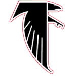 The overall logo design has remained consistent over the years, with only minor changes to some aspects of the design. Despite these little variations, the core identity of the logo remained the same. These changes were made to keep the logo relevant and fresh. The Falcon design was adjusted to be modern and suitable for the new uniforms, allowing it to connect with modern fans on a new level.
Wrap Up
Brand identity is an essential factor for any business or team. These logos are carefully designed to narrate a complete story about the core values and history of the team. Falcon is not only the logo of the team, but it also represents the people and city of Atlanta.
She Didn’t Even Know the WNBA… Then Caitlin Clark Happens
Subscribe to Our YouTube Channel