 Sports Logo History
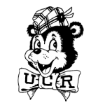
 UC Riverside Highlanders Primary Logo 1954 - 1989
Travel back to the year 1954. Some things the Baby Boomer generation may remember were the average cost of a new home being just over $10,000 and the average monthly rent is $85. Gas was 22 cents, Life Magazine was 20 cents, and the average cost of a movie ticket was 70 cents. However, something the baby boomer generation may not remember is the first-ever University of California Riverside Highlanders logo.
Just like how many of us believe everything back in the ’50s was black and white, so was the school logo. It painted a neutral picture showing a cartoonish-looking bear with a boy scout’s hat, wearing a bowtie that has ‘UCR’ on it. The first-ever logo for the school is still the longest active logo in school history, lasting for about 35 years before a new one was introduced in 1990. Since 1990, the school has gone through three variations of their logo and are now on to their fourth one as they enter the new decade.
 Sports Logo History
 UC Riverside Highlanders Primary Logo 2020 - Present
Unlike the original logo, the new Highlanders logo is full of vibrant color to help it stand out from the competition. Besides color being the biggest difference between the original and the latest, the other big difference is the disappearance of the bear, which has not been seen on a Riverside logo since 2011.
This logo is simple, yet elegant at the same time. Since the introduction of color into the school’s logo, the main colors have always been different shades of blue and yellow that were sometimes accompanied by neutral colors, such as black or gray. If you are a fan of the Los Angeles Rams, the logo colors may look very familiar to you because they aren’t that far off from each other.
These colors work extremely well together because of what each symbolizes. The blue symbolizes trust, faith, and power while the yellow symbolizes energy, cheer, and optimism. One thing to note, when the first colored logo for the school was released back in 2003, they made the change from black as the primary color, to blue as the primary color. This was not a surprising change when looking at it through a marketing lens because both blue and black represent power.
This is by far the simplest logo in school history but, as we have seen with many teams and organizations across the world, simple can be great. Companies have been opting for a more minimalist design to their logos to allow for more space and to not make it seem overcrowded to the person looking at it. Brand recognition is of the utmost importance and when you look at this logo, you immediately know it is UC Riverside.
See the UC Riverside Highlanders logo history.
Sports Logo History is a community of sports logo enthusiast who enjoys the history of each team’s logo history. Sports Logo History has primary logos, alternate logos, wordmark logos or concept logos from the NFL, NBA, MLB, MLS, NHL, Premier League, WNBA, CFL, NCAA, ABA, USFL, AAF, and XFL.
Our partner site is Sports Team History takes a look at the history of each and every professional sports team.

