Wordmark Logos
"The Legends May Retire, But the Gear is Forever"
History is written on the field, but it’s worn in the stands. From throwback threads to the latest sideline styles, grab your official NFL gear and carry the legacy of your team into the next generation.
Shop the Official NFL Collection
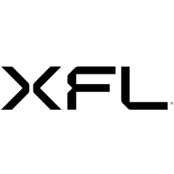
XFL Wordmark Logo
The XFL wordmark logo has undergone several transformations throughout history, reflecting the league's changing identity and vision. Let's delve into its captivating history and explore its various iterations.
In its original incarnation in 2001, the XFL introduced a bold and impactful wordmark logo. The logo featured the acronym "XFL" in all capital letters, each connected by sharp angles, creating a dynamic and edgy look. The font used was sleek and modern, reflecting the league's innovative approach to football. The color scheme incorporated black and red, adding a sense of power and intensity to the logo. This iconic wordmark logo quickly became synonymous with the XFL and significantly established its brand identity.
When the XFL made its highly anticipated return in 2020, the league unveiled a reimagined wordmark logo that embraced a more contemporary and sophisticated design. The new logo retained the acronym "XFL" but underwent significant changes in typography and layout. The letters were now presented in a clean and streamlined font, reflecting the league's commitment to a modern aesthetic. The spacing between the letters was adjusted, creating a balanced and visually appealing wordmark. The color scheme transitioned to a bold combination of blue and red, representing the league's energy and passion for the game.
Throughout its history, the XFL has experimented with different variations of its wordmark logo to align with its evolving brand and vision. From alternate color schemes to subtle typographic adjustments, each iteration aimed to capture the league's essence and convey its commitment to reimagining the football world. The XFL wordmark logo has become an iconic symbol that resonates with fans and embodies the league's determination to provide a unique and captivating sports experience.
As the XFL continues to evolve, we will likely witness further transformations of its wordmark logo. The league's ability to adapt and innovate will be reflected in its visual identity, as new wordmark logos will seek to captivate and engage fans in fresh and exciting ways. The XFL wordmark logo history is a testament to the league's commitment to pushing boundaries and redefining the landscape of professional football.
In conclusion, the XFL wordmark logo has evolved over the years, mirroring the league's dynamic and innovative spirit. From the bold and angular design of its original logo to the clean and contemporary aesthetics of its latest iteration, each wordmark logo has symbolized the XFL's commitment to delivering an extraordinary sports experience. As the league continues to captivate audiences with its unique brand of football, we can only anticipate the intriguing wordmark logo designs that will shape its future.

