The Chicago Cubs are a world-renowned club that was established in the 19th century, making them one of the oldest teams in both US and world sport. Playing a prominent role in the history of US baseball, the Chicago Cubs were one of the original eight MLB teams, is famed for being the founders of the NL!

Chicago Orphans Primary Logo 1898 - 1902
The logo of the Cubs postdates the team, coming years after the original Chicago White Stockings began playing in 1876. The first logo that the team used didn't appear until 1898 when they became known as the Chicago Orphans.
The team has undergone 15 changes since then and with many of these changes has come a logo redesign! Below, we look at the journey in which the club’s branding has been on, mapping the history of the famous logo and learning how it came to the iconic position it is in today.
As mentioned, during this time period 1898 - 1902, the team went by the name of the Chicago Orphans. With this first name change came its first-ever logo. The logo sported an old English letter "C," with its designer opting for a strong blue for its coloring. While marking the beginning of what would be a huge era in baseball, the team only promoted this logo for a short period and in the early 1900s, it changed again.

Chicago Cubs Primary Logo 1906
In 1903, the team changed its name to the Chicago Cubs but still operated using this logo concept. But, it wasn't long before the team decided it was time to be out with the old and in with the new, bringing a new logo into the mix in 1906.
In 1906, the club decided to change the old English type font to a block format, adding depth and boldness to the image. The new logo was a block letter "C" in brown, being more eye-catching and in line with the design trends of that time. This logo was pretty iconic and was tweaked again ever so slightly a year later. This revision included an update in the font while the brown lettering remained. Whist sporting this logo, The Cubs won their first-ever world series championship, making it a logo we see a lot in vintage merchandise and memorabilia.

Chicago Cubs Primary Logo 1908 - 1910
The logo went through a rather significant change when the year 1908 arrived, being the first time we saw a bear introduced to the imagery. A beige-colored bear was added inside the hollow of the "C," bringing personality to the logo. The bear had a bat in his hand, which the designer intended to be a sort of a brand mascot.
A second world series championship would follow with this logo in toe!
Later, the bear and bat were upgraded to a new color, with a strong navy blue replacing the original beige blush. All other elements to the logo were kept the same. While a successful time for the club, any losses were not received kindly, with some fans actually believing the brown bear to be a bad omen. This is arguably why both the "C" and the bear were revised in 1916, with new fonts, shapes, and colors introduced. The font of the "C" was stylized with a trim wishbone look and was colored red with a navy blue border.
1917 saw a radical change to the Cubs logo, with the first appearance of a wordmark logo for the Cubs. The logo was the name of the team, "Chicago Cubs", in block font with the "Chicago" element lightly arched above "Cubs". Another year passed and the logo received a new look, as the Cubs switched to a more rectangular and stretched out block "C" with a tan color. The letters "UBS" were nested in the hollow of the "C," in blue. The "Chicago" part was also taken off.
For the next seven years, the Cubs would revert to the trim wishbone red "C," bordered by a blue outline. This logo's "UBS" got the wishbone look as well, still in blue and nested inside the "C".

Chicago Cubs Primary Logo 1918
Then from 1927 - 1936, the standing navy blue bear holding a bat was brought back to replace the "UBS" inside the "C," with the outline of the "C" changed from blue to a matching navy blue. This made a nice color contrast and was regarded by fans as one of the better versions of the logo.
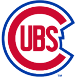
Nearing the end of the Second World War and arguably to mark the change in times, the Cubs changed their logo's lead image to the head of an angry bear cub, colored brown. A small "™" was added to the right side of the bear. After the war, the Cubs reverted to the rounded letter "C," this time thicker, with the letters "UBS" inside the "C." The letters were in red and outlined by a single blue border.

Chicago Cubs Primary Logo 1948 - 1956
From 1948 - 1956, the club used the same logo but the thickness of the "C" was reduced slightly. There was also more space between the "C" and the outline, which was now more jagged to take the shape of the letters. The hue of the border was then changed to navy blue in 1957 and the shape took on a smooth round shape around the "C."

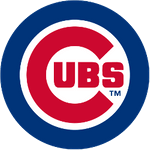
Chicago Cubs Primary Logo 1979 - Present
Finally, in 1979 the logo took the form we know today, with the font of the letters made bolder, alongside the outline. The "™" was moved to within the outline but still on the right side below the letters.
It’s safe to say that the logo has been on a pretty long journey. However, having now used the same logo for more than 40 years, is the current image here to stay? Is the search for the perfect logo finally over?
See the Chicago Cubs logo history and team history.
___
Sports Logo History is a vibrant community of sports logo enthusiasts who share a deep appreciation for the captivating histories behind each team's logo. We take pleasure in exploring the evolution of primary logos, alternate logos, and wordmark logos from renowned leagues such as the NFL, NBA, MLB, MLS, NHL, Premier League, WNBA, CFL, NCAA, UFL, ABA, USFL, AAF, and XFL. Immerse yourself in the intricate details and stories behind these iconic symbols that represent the essence of each team.
In the enthralling realm of sports, the battle of logos among different leagues unfolds as a captivating and ongoing spectacle. Step into the world of Sports Logo History, where we showcase the relentless pursuit of distinction by leagues such as the NFL, NBA, MLB, Premier League, and countless others. Witness the captivating journey as each league strives to create logos that not only capture the essence of their sport but also resonate deeply with fans.
Immerse yourself in the comprehensive sports history provided by Sports Team History, our esteemed partner site, where you can discover the triumphs, challenges, and defining moments that have shaped the legacies of professional sports teams. Stay up to date with the latest sports news through Sports News History, a platform delivering 24/7 coverage of highlights, player interviews, and game analyses. Additionally, express your unwavering support for your favorite teams by exploring Sports Store History, the premier sports team marketplace offering a vast selection of jerseys, memorabilia, and collectibles. Join our community today and celebrate the rich history, iconic logos, and passion of sports.

