Montreal Canadiens Primary Logo 2000 - Present
The logo of the Montreal Canadiens has endured for over 100 years. It’s one of the most recognizable logos in sports. The Montreal Canadiens hockey team uses a logo that has undergone some updates since its inception in 1909. Few adjustments have been made, although it has been kept almost as it has been since 1917. The 1913 season marked the start of a whole new era in logo history. The large modern red letter "C" has become the centerpiece of the symbol. The letter "A" was visible inside. Over the next four decades, the club altered the shape of the letter "C" and the thickness of the outline, until 1957 when it finally came to the shape that was originally used. Let’s take a look at how the logo was created and what the inspiration was behind it.
The Montreal Canadiens, The Pride of Quebec!

Montreal Canadiens Primary Logo 1922
The Montreal Canadiens is a member of the North Division in the National Hockey League. Located in the province of Quebec in Canada, this professional ice hockey team is the pride of the country. Hockey, a Canadian creation and national sport, is such a popular pastime that it transcends generations and invades urban space, starting with the parks and lakes of the metropolis. Bookmakers are happy to bet on their favorite sportsmen, such as Casumo sports betting. The real face of Montreal hockey lies in its Canadiens team, for which the locals thrill. A cult that is sometimes difficult for newcomers to understand, considering the club's poor results in recent years. But, beyond sport, the history of this team is linked to the history of its city, and it becomes a true social and societal mirror.
The True Story of The Montreal Canadiens Logo
The Montreal Canadiens team was formed in late 1909 as a founding member of the National Hockey

Montreal Canadiens Primary Logo 1913
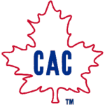
Association. However, it later became the National Hockey League (NHL). The original logo was simple. It was a blue letter “C” with a decorative element at its top end. The following year, the team replaced their logo with a more memorable one. It featured a large letter "C" with a small letter "A" inside. The letters stood for “Canadian Athletic”. The design was placed inside a green maple leaf, a true symbol of Canada. In 1912, the leaf disappeared. Only the letters “C” and “A” had turned red with a blue outline. The following season, the maple leaf returned with the blue letters “CAC” (Club, Athletic, and Canadiens).
The Origins of the Colors of The Montreal Canadiens Logo
Red, blue and white is the official team palette. This also appears on the wordmark, kits, and secondary logos. These colors have been used with slight color changes since 1911. The blue-white-red represents

Montreal Canadiens Primary Logo 1920 - 1921
France, therefore the French speakers but it also represents the Union Jack, therefore the English speakers. These colors later went well with Molson, the club's new owner in the 1950s! There is also a stubborn myth surrounding the Montreal Canadiens logo: the "H" in the logo is not for "Habitant" but for "Hockey". Legend has it that the error occurred in 1924 when it was reported to Tex Rickard, former owner of Madison Square Garden, who in turn repeated it to a reporter, causing confusion. Also, 10 years earlier, sports journalists from Montreal have already used the nickname Habs.
Last Modification of The Montreal Canadiens Logo
The last time the Montreal Canadiens logo was revisited was before the 1999-2000 season. Again, this was only a minor modification. We didn't even touch the shape of the emblem or the other elements, just the colors. So the red and blue became darker, making the emblem a little nobler.
___
Sports Logo History is a vibrant community of sports logo enthusiasts who share a deep appreciation for the captivating histories behind each team's logo. We take pleasure in exploring the evolution of primary logos, alternate logos, and wordmark logos from renowned leagues such as the NFL, NBA, MLB, MLS, NHL, Premier League, WNBA, CFL, NCAA, UFL, ABA, USFL, AAF, and XFL. Immerse yourself in the intricate details and stories behind these iconic symbols that represent the essence of each team.
In the enthralling realm of sports, the battle of logos among different leagues unfolds as a captivating and ongoing spectacle. Step into the world of Sports Logo History, where we showcase the relentless pursuit of distinction by leagues such as the NFL, NBA, MLB, Premier League, and countless others. Witness the captivating journey as each league strives to create logos that not only capture the essence of their sport but also resonate deeply with fans.
Immerse yourself in the comprehensive sports history provided by Sports Team History, our esteemed partner site, where you can discover the triumphs, challenges, and defining moments that have shaped the legacies of professional sports teams. Stay up to date with the latest sports news through Sports News History, a platform delivering 24/7 coverage of highlights, player interviews, and game analyses. Additionally, express your unwavering support for your favorite teams by exploring Sports Store History, the premier sports team marketplace offering a vast selection of jerseys, memorabilia, and collectibles. Join our community today and celebrate the rich history, iconic logos, and passion of sports.

