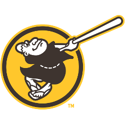
Continuing a trend started by Toronto Blue Jays, Houston Astros, and Baltimore Orioles – clubs that looked to the past when creating new logos – the San Diego Padres are perhaps making the most significant statement yet. Brown is back. Yellow (gold) is back. The Swinging Friar is back. Those were the primary colors for the team from its inception …

San Diego Padres Logo History – Wordmark Logo
The San Diego Padres wordmark logo collection celebrates the team’s vibrant MLB legacy. Featuring bold script designs, the San Diego Padres logo fuels team spirit. This collection highlights team history, uniting fans with the dynamic heritage of San Diego Padres baseball. San Diego Padres 2020 – Present For the 2020 season, the Padres unveiled a new color for their primary …
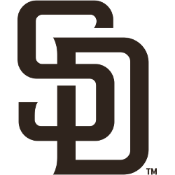
San Diego Padres Logo History – Alternate Logo
The San Diego Padres alternate logo collection showcases the team’s vibrant MLB legacy. Featuring bold friar and “SD” designs, the San Diego Padres logo boosts team spirit. This collection highlights Padres logo history, uniting fans with the dynamic tradition of San Diego’s baseball franchise. San Diego Padres 2020 – Present For the 2020 season, the Padres unveiled a new color …
San Diego Padres Logo History – Primary Logo
The San Diego Padres primary logo embodies the team’s vibrant MLB spirit. With its iconic swinging friar, the San Diego Padres logo shines with pride. This collection of primary logos unites fans, showcasing the franchise’s dynamic legacy at Petco Park. San Diego Padres 2020 – Present For the 2020 season, the Padres unveiled a new color for their primary logo, …