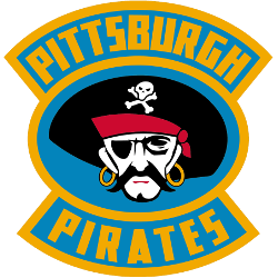
The Pittsburgh Pirates hockey logo fronts the team’s primary logo collection, shining in the NHL from 1925 to 1930. Its bold design reflects Pittsburgh’s gritty spirit. Therefore, the Pittsburgh Pirates hockey team’s emblem draws fans, showcasing the Pittsburgh Pirates hockey logo’s historic depth and regional pride.Pittsburgh Pirates 1928 – 1929 A black, white, red, and yellow pirate’s head inside a …
Pittsburgh Pirates Logo History – Primary Logo
The Pittsburgh Pirates primary logo captures the team’s bold MLB heritage. With its iconic “P” and pirate imagery, the Pittsburgh Pirates logo radiates pride. This collection of primary logos unites fans, showcasing the franchise’s storied tradition at PNC Park. Pittsburgh Pirates 2015 – Present The Pirates chose to use a old english letter “P” in yellow, going back to the …
Pittsburgh Pirates Logo History – Primary Logo
The Pittsburgh Pirates logo reflected the early days of what would become the Pittsburgh Steelers. From 1933 to 1939, the team shared its name—and look—with the city’s baseball club. The design was simple, using bold black and gold colors. Although short-lived, the old Pittsburgh Pirates logo marked the start of a franchise that would grow into one of the NFL’s …


