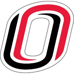
The Nebraska-Omaha Mavericks logo history showcases how the program’s identity evolved through consistent wordmark branding. The UNO Mavericks wordmark logo reflects school pride and clarity, while the Omaha Mavericks logo remains a recognizable element across athletics, merchandise, and official media from early designs to present-day formats. Nebraska-Omaha Mavericks 2011 – Present An interlocked letter “O” with a red letter “O” …
Nebraska-Omaha Mavericks Logo History – Alternate Logo
The Nebraska-Omaha Mavericks logo history highlights the evolution of the team’s alternate branding over the years. This page showcases every Omaha Mavericks logo, along with official UNO Mavericks alternate logo designs and high-quality Omaha Mavericks logo images, illustrating the team’s growth and dynamic identity. Nebraska-Omaha Mavericks 2011 – Present An interlocked letter “O” with a red letter “O” and a …
Nebraska-Omaha Mavericks Logo History – Primary Logo
The Nebraska-Omaha Mavericks logo has evolved significantly over the years, reflecting the identity of UNO athletics. This page highlights the UNO Mavericks primary logo, including official Omaha Mavericks logo versions, showing how the design has remained bold, recognizable, and consistent across all uniforms, merchandise, and media platforms. Nebraska-Omaha Mavericks 2011 – Present An interlocked letter “O” with a red letter …


