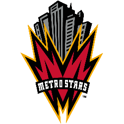
New York/New Jersey MetroStars 1996 – 1997 A red with a black and orange trim letter “M” shaped like a lightning bolts. Above the letter is a black and great NY cityscape and wordmark positioned on the letter “METROSTARS” in white.MetroStars Primary LogoMetroStars Alternate LogoMetroStars Team HistoryThank you for visiting Sports Logo History! If you use our logos for news, …
New York/New Jersey MetroStars Alternate Logo
MetroStars Alternate Logo The New York/New Jersey MetroStars have a long and storied history when it comes to their alternate logos. The team was founded in 1996 as one of the original ten teams in Major League Soccer, and they have had several different alternate logos over the years. One of their most popular designs is known as “the Metros” …
New York/New Jersey MetroStars Logo History – Primary Logo
The New York/New Jersey MetroStars logo remains a legendary symbol of early American soccer culture and East Coast grit. Since 1996, the NYNJ MetroStars identity has shifted from high-energy skyscrapers to the famous red and black “Taxi” stripes. You can find every official Metrostars logo in our archive. MetroStars Alternate LogoMetroStars Wordmark LogoMetroStars Team History Thank you for visiting Sports …


