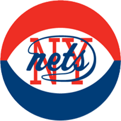
Nets Primary Logo The original New York Nets logo in 1969 tried to be a “net” looking logo, however, it came across as a western ho-down logo. The final Nets logo did it right, adding the red, white, and blue basketball and still keeping the original logo placed in the center of the basketball changed the whole look and feel …
New Jersey Nets Primary Logo
Nets Primary Logo The final New Jersey Nets logo is such a bold and stoic logo with a 3-D shield and the basketball popping out of the shield. The ring around the basketball or the hoop is a nice design touch. The other three previous logos are OK, however, the first or the carryover logo from New York is the …
Brooklyn Nets Primary Logo
Nets Primary Logo The Brooklyn Nets will have a black-and-white color scheme, which pays homage to the old New York subway signage system. This new logo is now called “the new badge of Brooklyn” by a very optimistic Nets CEO Brett Yormark. The logo was designed by part owner and hip hop legend Jay-Z’s design group, Timothy Morris (the one …