The Minnesota Lynx logo evolution represents an intriguing study in sports branding, reflecting broader cultural shifts in women’s professional basketball. Design historians and sports researchers continue examining how team imagery adapts to changing aesthetic preferences while maintaining core identity elements. This logo-driven paradigm may seem shallow, but it largely contributes to other sports-related landscapes, including sports betting. Line Reading, which …
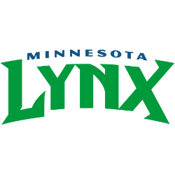
Minnesota Lynx Logo History WNBA – Wordmark Logo
The Minnesota Lynx logo, a bold wordmark, defines the team’s Minnesota Lynx WNBA identity. Since 1999, its sleek typography in team colors shines in Minnesota Lynx basketball games. For example, the wordmark, featuring “LYNX,” reflects Maya Moore’s championship legacy. Curious about Minnesota Lynx logo history? See how this wordmark shapes the team’s iconic journey! Minnesota Lynx 2018 – Present A …

Minnesota Lynx Logo History WNBA – Alternate Logo
The Minnesota Lynx logo, as an alternate design, roars with Minnesota Lynx WNBA pride. Evolving since 1999, these logos, in bold blue and green, ignite Minnesota Lynx basketball games. From the 2010 leaping lynx to the 2012 “M” with stars, alternate logos reflect Minnesota Lynx logo history. See their fierce journey in Minneapolis. Minnesota Lynx 2018 – Present A blue …
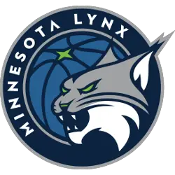
Minnesota Lynx Logo History WNBA – Primary Logo
The Minnesota Lynx logo embodies Minnesota Lynx WNBA pride, evolving since 1999. Its bold design fuels Minnesota Lynx basketball passion, reflecting Minnesota Lynx logo history through dynamic changes. With midnight navy and aurora green, the primary logos capture the team’s fierce legacy. See how these emblems mark the Lynx’s championship journey. Minnesota Lynx 2018 – Present A blue with dark …