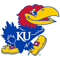
Jayhawks Alternate Logo The Kansas Jayhawks alternate logo has been a part of the school’s identity for over 30 years. The original design was created in 1989 and featured an interlocking “KU” with the mascot, Big Jayhawk, perched atop it. Since then, the logo has gone through several changes to keep up with current trends and styles while still remaining …
Kansas Jayhawks Wordmark Logo
Jayhawks Wordmark Logo The Kansas Jayhawks wordmark logo has been part of the university’s identity since its inception in 1886. The original design featured a blue and white “KU” with an eagle perched atop it, which was meant to represent the spirit of American independence. Over time, this logo evolved into what we know today – a simple yet powerful …
Kansas Jayhawks Primary Logo
Jayhawks Primary Logo The Kansas Jayhawks have a long and storied history in college sports, and their primary logo is no exception. The original design was created by Henry Maloy in 1912 for the school’s basketball team. It featured an interlocking “KU” with a daisy beneath it, representing the state of Kansas’ official flower at the time. This design remained …