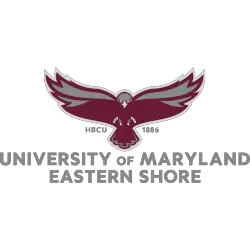
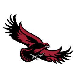
Hawks Wordmark Logo The Milwaukee Hawks used this wordmark logo on official team letterheads and other correspondence. It shows the name of the team in a bold double blue sans serif typeface laid out horizontally. Hawks Primary LogoHawks Team History Sports Logo History thanks you for visiting our logo site. If you are using any of our logos for news, …
Atlanta Hawks to Come Out of Quarantine With New Look
The Atlanta Hawks are not one of the teams invited to the “bubble” at Walt Disney World to resume the 2019 – 2020 NBA season, but the franchise is making news in other ways. Namely, a new set of logos and uniforms to debut whenever the 2020 – 2021 season tips off. We’ve seen a lot of teams draw inspiration …
St. Joseph’s Hawks Wordmark Logo
Hawks Wordmark Logo The St. Joseph’s Hawks have had one wordmark logo since 2001. Their logo consists of a custom font, with a stoic look to the wordmark logo. Hawks Primary LogoHawks Alternate Logo Sports Logo History thanks you for visiting our logo site. If you are using any of our logos for news, blogs, flyers, posters, or social media …
St. Joseph’s Hawks Alternate Logo
Hawks Alternate Logo Excellent supply of alternate logos for the St. Joseph’s Hawks. In 2001 they updated and made available many variations of their high soaring hawk. Hawks Primary LogoHawks Wordmark Logo Pick your favorite current St. Joseph’s Hawks alternate logo? St. Joseph’s Hawks Alternate Logo 2019 – Present St. Joseph’s Hawks Alternate Logo 2019 – Present Vote Sports Logo …
St. Joseph’s Hawks Primary Logo
Hawks Primary Logo The St Joseph’s Hawks started with a cartoon-looking hawk as their primary logo and update the logo in 2001. The new and updated hawk is a high soaring hawk looking down on its prey. Hawks Alternate LogoHawks Wordmark Logo Choose your favorite St. Joseph’s Hawks primary logo? St. Joseph’s Hawks Primary Logo 2019 – Present St. Joseph’s …
Atlanta Hawks Alternate Logo
Hawks Alternate Logo The new primary logo in 2015, came as a set of several alternate logos for the Atlanta Hawks. Lots of colors and designs from the different colored primary logos to the flying basketball. The abbreviation of Atlanta “ATL” has a new font script. Hawks Primary LogoHawks Wordmark LogoHawks Team History Pick your favorite current Atlanta Hawks alternate …
Atlanta Hawks Wordmark Logo
Hawks Wordmark Logo The Atlanta Hawks have a great collection of wordmark logos with full names and abbreviations. Nice unique fonts are used throughout the collection. Hawks Alternate LogoHawks Primary LogoHawks Team History Select your favorite Atlanta Hawks wordmark logo? Atlanta Hawks Wordmark Logo 2021 – Present Atlanta Hawks Wordmark Logo 2021 – Present Atlanta Hawks Wordmark Logo 2015 – …
Milwaukee Hawks Primary Logo
Hawks Primary Logo During their 3 years in Milwaukee, the Milwaukee Hawks had two versions of the same logo. After relocating from Tri-City to Milwaukee the Hawks used a high-flying hawk above a basketball hoop carrying a basketball. Hawks Wordmark LogoHawks Team History Sports Logo History thanks you for visiting our logo site. If you are using any of our …
St. Louis Hawks Primary Logo
Hawks Primary Logo The St. Louis Hawks’ first logo of a flying hawk carrying a basketball in its claws, looks like it might have been thrown together very quickly. Not much detail to this logo. The second and final logo in St. Louis has character. The hawk holding a basketball has greater detail for us to see the hawk and …
Atlanta Hawks Primary Logo
Hawks Primary Logo “Our fans have been so excited by the return of the iconic Pac-Man logo,” CEO Steve Koonin of the Atlanta Hawks said. In 2021, the Hawks changed the font used in the wordmark and remove the word “CLUB” from their primary logo. Hawks Alternate LogoHawks Wordmark LogoHawks Team History Choose your favorite reverse pacman Atlanta Hawks logo? …