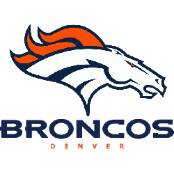
The Denver Broncos logo wordmark features bold, uppercase lettering with clean lines and a forward-leaning stance. Typically shown in navy or orange, it matches the energy of the team’s visual identity. While most fans recognize the leaping horse emblem, the wordmark is equally important. Over time, its minimal changes reflect stability in branding. This design remains a reliable part of …
Denver Broncos Logo History NFL – Alternate Logo
The Denver Broncos logo has changed over the years, but each version keeps the team’s bold identity. Alternate logos highlight different styles, such as classic bronco heads, stylized “D” designs, or unique color outlines. These versions offer fans fresh ways to represent the team while staying true to its tough, fast-paced image. Denver Broncos 2002 – Present A profile of …
Denver Broncos Logo – Primary Logo History
The Denver Broncos logo is a fierce and dynamic emblem that perfectly represents the team’s power and energy. Known for its iconic white stallion with a fiery orange mane, the logo captures both speed and intensity. Whether you’re downloading the Denver Broncos logo PNG or reviewing its legacy, the design remains one of the most admired in the NFL. Denver …


