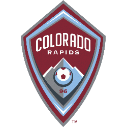
Rapids Wordmark Logo The Colorado Rapids wordmark logo has a long and storied history. It dates back to the team’s inception in 1996 when it was first introduced as part of their inaugural season uniform. The original logo featured an illustration of a mountain range with three peaks, representing the Rocky Mountains that tower over Denver where the Rapids play …
Colorado Rapids Alternate Logo
Rapids Alternate Logo The Colorado Rapids have been around since 1996, and they’ve had an interesting logo history. The original logo featured a mountain range with the team name written across it in bold lettering. This design was used until 2003 when the team changed its primary logo to feature a shield-shaped crest with two crossed soccer balls inside of …
Colorado Rapids Primary Logo
Rapids Primary Logo The Colorado Rapids have had a long history of logos, dating back to the team’s inception in 1996. The first logo was designed by graphic designer Tom O’Grady and featured an image of a mountain range with three white peaks on top of a navy blue background. This logo remained unchanged until 2001 when the team adopted …