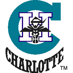
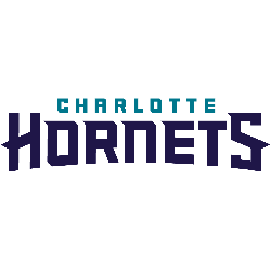
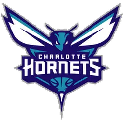
The first Charlotte Hornets had only two alternate logos in their short stay before moving to New Orleans. The enlarge primary logo without the wordmark is nice. Hornets Primary LogoHornets Team History Sports Logo History thanks you for visiting our logo site. If you are using any of our logos for news, blogs, flyers, posters, or social media graphics, please …
Charlotte Hornets Wordmark Logo
The Hornets wordmark logo history is short, with four different logos from 2014. Nice variation and combination of logos. Hornets Alternate LogoHornets Primary LogoHornets Team History Select your favorite Charlotte Hornets wordmark logo? Charlotte Hornets Wordmark Logo 2014 – Present Charlotte Hornets Wordmark Logo 2014 – Present Charlotte Hornets Wordmark Logo 2014 – Present Charlotte Hornets Wordmark Logo 2014 – …
Charlotte Hornets Alternate Logo
When the Charlotte Bobcats changed back to the nickname of Hornets, of course, a whole new set of logos came along as well. The alternate logos have a great variety from the “Buzz City” logo to the different designs of the teal and blue hornet. The Bobcats started the tradition of several and quality design of alternate logos. Hornets Primary …
Charlotte Hornets (Pelicans) Primary Logo
The expansion Charlotte Hornets first and the only logo has a fun loving hornet dribbling a basketball. The design and color combination is nice, using teal in a logo always seems to be a hit. Hornets Alternate LogoHornets Team History Sports Logo History thanks you for visiting our logo site. If you are using any of our logos for news, …
Charlotte Hornets Primary Logo
“We recognize the heritage behind the original logo and our goal was to connect to the past but also include elements of evolution,” Fred Whitfield added. The city’s rebelliousness, aggressiveness, and protective attributes date to the Revolutionary War when British commander General Cornwallis referred to Charlotte as “a hornet’s nest of rebellion.” Hornets Alternate LogoHornets Wordmark LogoHornets Team History Choose …