Primary Logos

Chattanooga Mocs
A block letter "C" in gold with white and blue trim. Called the power "C" logo. The gap was removed from the previous logo.

East Tennessee State Buccaneers
The cross piece is shaped like a sword and features a custom letter "E" in navy with gold trim.

Furman Paladins
A block letter "F" in white on a purple diamond shape with white and purple trim. A new shade of purple
Mercer Bears
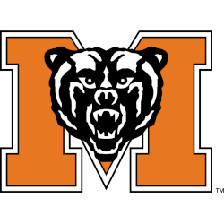
A bear's head in black and white on a block letter "M" in orange with white and black trim.
Samford Bulldogs
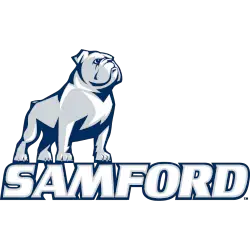
A proud pose of a bulldog in blue, silver, and white resting on the wordmark "SAMFORD" in white with blue and silver trim. Design by Dartlet Inc.
The Citadel Bulldogs
The block letter "C" is in infantry blue, with a blue trim and a blue star in the middle of the letter "C."
UNC Greensboro Spartans
A Spartan's head in blue and silver, wearing a gold helmet with a blue plume above the initials "UNCG," the letters "UNC" in white, and the letter "G" in gold on a blue-formed background.

VMI Keydets
Interlocked initials "VMI" with the letter "V" in gold with red trim, the letter "M" in red, and the letter "I" in white with red trim encircled with wordmark "VIRGINIA MILITARY INSTITUTE" in black.

Western Carolina Catamounts
The arched initials "WCU" in white with purple and gold trim are over a side view of Catamount's head in purple, gold, and white. A new shade of gold.
Wofford Terriers
A black and white terrier's head with a gold-and-black studded collar is above the wordmark "WOFFORD" in black and "TERRIERS" in gold.
College Sports Fan Products
Southern Primary History
The Southern Conference, often called the SoCon, has a rich and storied history reflected in its primary logo. Established in 1921, it is the fifth-oldest major college athletic conference in the United States and the third or fourth oldest in continuous operation. The logo has evolved, reflecting the growth and changes within the conference itself.
The Southern Conference's original logo, like the organization itself, was straightforward. It was designed to represent the unity and shared purpose of the member institutions. The logo has always incorporated the conference's name, "Southern Conference," but over the years, it has evolved to reflect the changing times and the conference's growth.
In the early years, the logo was a simple text-based design. However, as the conference grew and evolved, so did its visual identity. The logo was updated to include a stylized compass representation, symbolizing the conference's direction and purpose. The compass points to the south, representing the geographical location of the member institutions.
The current Southern Conference logo, a modern and dynamic design, features the compass as a central element with a more stylized and contemporary look. The logo is rendered in blue, often associated with tranquility and peacefulness. This color choice reflects the conference's commitment to fostering a supportive and positive environment for its student-athletes.
The evolution of the Southern Conference's primary logo mirrors the conference's growth and transformation. From its humble beginnings to its current status as a major college athletic conference, the SoCon's logo has always been a visual representation of its identity and values.


