With the addition of Russell Westbrook, along with the Golden State Warriors losing Kevin Durant and Klay Thompson for most of the season with an injury, the Houston Rockets are debuting a new look in a season in which they hope to finally overcome their rival.
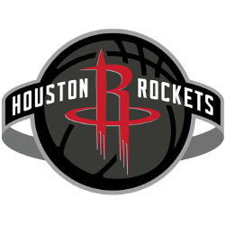
The new logo features the same primary icon – a red “R” partially composed of a rocket, blasting off through a circle that could be interpreted as a basketball rim.
The rest of the logo is brand new.

Houston Rockets Primary Logo 2020 - Present
It features a gray and black basketball behind the primary icon, with a ring orbiting the basketball. The city and nickname are written in white inside the orbit, on each side of the “R” icon. The font used is similar to the one in the primary logo that has been used since 2003, but it’s not quite the same.
In a press release, the team says the logo will be used internationally, as it “matches the desire of the franchise to be champions of the basketball world.”
The new font is transferring to the uniforms, which maintain their traditional red and white look. The only difference is the addition of a black uniform, with the team name in white, outlined in red.
This marks the fifth primary logo change for the franchise, dating back to their move from San Diego to Houston in 1971. The first logo, however, lasted only one season, before the team adopted what is known as the “ketchup and mustard” look that it would be known for during the Hakeem Olajuwon era – a yellow basketball with a red circle around it that appears to be either a flame or a comet, with an italicized Rockets written in black inside the yellow ball.

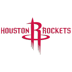
Houston Rockets Primary Logo 2004 - 2019
After winning back-to-back NBA titles in 1994 and 1995, the team dramatically changed its logo, having maintained the same look for 23 years. The new look was a red basketball with a rocket circling and then leaving the basketball’s orbit. The team name was written in a futuristic font in metallic silver.
This look, along with the team’s pinstriped uniforms, was probably most famous while Charles Barkley played for the team. It lasted only eight seasons before the current primary icon was developed, along with the logo that was used up until this season.
On the court, the team traded Chris Paul for Westbrook this offseason, intending to finally eclipse the Warriors, as well as fending off challenges from the Los Angeles Lakers and Los Angeles Clippers, both of which beefed up their rosters this summer. On their way to five-straight Western Conference titles, the Warriors eliminated the Rockets in four of those seasons, with the most painful being a Game 7 loss in the 2018 Western Conference Finals – a series in which Houston had home-court advantage.
See the Houston Rockets logo history and team history.
___
Sports Logo History is a vibrant community of sports logo enthusiasts who share a deep appreciation for the captivating histories behind each team's logo. We take pleasure in exploring the evolution of primary logos, alternate logos, and wordmark logos from renowned leagues such as the NFL, NBA, MLB, MLS, NHL, Premier League, WNBA, CFL, NCAA, UFL, ABA, USFL, AAF, and XFL. Immerse yourself in the intricate details and stories behind these iconic symbols that represent the essence of each team.
In the enthralling realm of sports, the battle of logos among different leagues unfolds as a captivating and ongoing spectacle. Step into the world of Sports Logo History, where we showcase the relentless pursuit of distinction by leagues such as the NFL, NBA, MLB, Premier League, and countless others. Witness the captivating journey as each league strives to create logos that not only capture the essence of their sport but also resonate deeply with fans.
Immerse yourself in the comprehensive sports history provided by Sports Team History, our esteemed partner site, where you can discover the triumphs, challenges, and defining moments that have shaped the legacies of professional sports teams. Stay up to date with the latest sports news through Sports News History, a platform delivering 24/7 coverage of highlights, player interviews, and game analyses. Additionally, express your unwavering support for your favorite teams by exploring Sports Store History, the premier sports team marketplace offering a vast selection of jerseys, memorabilia, and collectibles. Join our community today and celebrate the rich history, iconic logos, and passion of sports.
