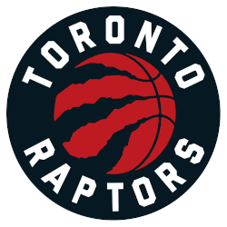
The Toronto Raptors have had three different logos in their 25-year history and now they have a fourth. If you remember back in 2015, the Raptors removed their loving Raptor dinosaur from the logo that was used from their first season back in 1995. The new logo was a basketball with claw marks, a way to remember where the Raptor once was and how he left a mark on the franchise.

Toronto Raptors Primary Logo 2021 - Present
The new logo featured a grey basketball with a black circle, white words, and red trim. While the Raptors didn’t fully change anything from that, they have decided on a brand new color palette. The new logo still features the basketball and the same words. The big difference now is that the grey has been completely removed from the logo. The ball is now that bright Raptor red that they wore when they won the NBA Finals in 2019. The circle remains black but there is no longer any trim. It looks very sharp and a bit more refined than the previous symbol.
History of the Logo
As mentioned before, the Raptors have gone through four iterations of their logo. Their first logo with the Raptor playing basketball and a hint of purple was used from 1995 - 2008. After the 2008 season, the Raptors did a bit of a color palette change. They removed all purple from the logo and went to a red that is similar if not identical to the red that is used today. They still kept the dinosaur but it had a new look to it. This was similar to the Arizona Diamondbacks losing their purple and gold and going to Sedona red in the 2000s.
After the 2015 season, a complete redesign was had and the logo was merely a basketball with cracks around it, resembling a cracked dinosaur shell. It was the end of an era in Toronto but one that has been a great rebrand for the team and has helped them take on brand new identity. While they don’t rep that old uniform
Meaningful Redesign
Fans have enjoyed how the new logo has helped shape their team and created a new image of the Toronto Raptors. However, it’s hard to argue with those beautiful purple jerseys and it is fun to imagine the team still repping the fun dinosaur.
The Raptors logo no longer is associated with just a basketball team, which they lost when they took away the dinosaur. But as their logos have changed, it has become a “We the North” rallying cry. By taking most of the attention away from the dinosaur and more on the city, it has resonated with fans.
Temporary Logo
For the 2020-21 season, the Raptors will play in Tampa Bay due to COVID-19 restrictions in Canada. The team mocked up a fun temporary training camp logo that fans have mixed reviews about! It features that lovable dinosaur gnawing on a palm tree.
This fan seems to be upset that his beloved Toronto was removed from the temporary training camp logo altogether.
See the Toronto Raptors logo history and team history.
___
Sports Logo History is a vibrant community of sports logo enthusiasts who share a deep appreciation for the captivating histories behind each team's logo. We take pleasure in exploring the evolution of primary logos, alternate logos, and wordmark logos from renowned leagues such as the NFL, NBA, MLB, MLS, NHL, Premier League, WNBA, CFL, NCAA, UFL, ABA, USFL, AAF, and XFL. Immerse yourself in the intricate details and stories behind these iconic symbols that represent the essence of each team.
In the enthralling realm of sports, the battle of logos among different leagues unfolds as a captivating and ongoing spectacle. Step into the world of Sports Logo History, where we showcase the relentless pursuit of distinction by leagues such as the NFL, NBA, MLB, Premier League, and countless others. Witness the captivating journey as each league strives to create logos that not only capture the essence of their sport but also resonate deeply with fans.
Immerse yourself in the comprehensive sports history provided by Sports Team History, our esteemed partner site, where you can discover the triumphs, challenges, and defining moments that have shaped the legacies of professional sports teams. Stay up to date with the latest sports news through Sports News History, a platform delivering 24/7 coverage of highlights, player interviews, and game analyses. Additionally, express your unwavering support for your favorite teams by exploring Sports Store History, the premier sports team marketplace offering a vast selection of jerseys, memorabilia, and collectibles. Join our community today and celebrate the rich history, iconic logos, and passion of sports.

