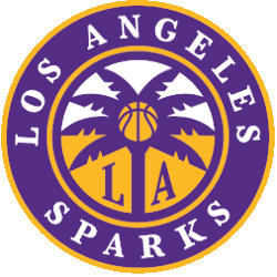
To commemorate the organization’s 25th anniversary in the WNBA, the Los Angeles Sparks have unveiled a new logo and primary look starting in the 2021 season.

Los Angeles Sparks Alternate Logo 2021 - Present
From 1996 until just a couple of weeks ago, the Sparks’ identity has remained the same. That is until the organization felt like it needed a change-up. The traditional primary logo was very 1990s and early 2000s pop art.
The primary logo featured a turquoise basketball behind the Los Angeles Sparks script in yellow. The purple accent color sat between the basketball and the letters to provide a popping contrast. The yellow and purple are synonymous with Los Angeles basketball, both in the WNBA and NBA Lakers.
Although this has been the primary logo for so long, many casual fans know the organization from the yellow and purple script that matches the Lakers of the NBA.
The trend of updating looks is slowly taking over a number of franchises in the WNBA and other professional leagues. We saw this with the Seattle Storm recently who evaluated the old look and decided that it needed a modern update. We will likely see even more of this in the future, and the Sparks are the latest example.
Now, the primary logo will feature a modern take on Los Angeles culture and vibes. First off, they drop the light blue color that was previously featured in the basketball. This was a change that could be predicted because it seemed to be unfit for the organization’s brand and identity. Plus, it stuck out in a way that did not make much sense.

Los Angeles Sparks Primary Logo 2021 - Present
The new primary logo is actually an updated version of the original alternate logo. Right in the middle, there is a yellow basketball that is the center of a purple palm tree. This is in front of a yellow and white background with the letters L and A in purple. All of this is surrounded by a purple outer ring with the words “Los Angeles Sparks” in a new, white font.
This is an updated version of the traditional alternate logo with a color change and a few tweaks.
The entire reason for the new logo is to commemorate the 25th year of the Sparks being in the WNBA. The Sparks are one of just three original WNBA teams (New York Liberty and Phoenix Mercury) that are still in existence, so the tradition and history are rooted deep in LA.
In terms of moving forward, the old primary logo will remain on deck for heritage use, and there will continue to be black and white alternate looks. The wave of simplistic, minimalist design is taking over professional sports, and that could be seen through the Sparks’ new identity.
So, moving forward, the Sparks will embrace the organization's and the city of Los Angeles's rich history while being updated for the 21st century. You can see this new and improved look during the 2021 season.
See the Los Angeles Sparks logo history and team history.
___
Sports Logo History is a vibrant community of sports logo enthusiasts who share a deep appreciation for the captivating histories behind each team's logo. We take pleasure in exploring the evolution of primary logos, alternate logos, and wordmark logos from renowned leagues such as the NFL, NBA, MLB, MLS, NHL, Premier League, WNBA, CFL, NCAA, UFL, ABA, USFL, AAF, and XFL. Immerse yourself in the intricate details and stories behind these iconic symbols that represent the essence of each team.
In the enthralling realm of sports, the battle of logos among different leagues unfolds as a captivating and ongoing spectacle. Step into the world of Sports Logo History, where we showcase the relentless pursuit of distinction by leagues such as the NFL, NBA, MLB, Premier League, and countless others. Witness the captivating journey as each league strives to create logos that not only capture the essence of their sport but also resonate deeply with fans.
Immerse yourself in the comprehensive sports history provided by Sports Team History, our esteemed partner site, where you can discover the triumphs, challenges, and defining moments that have shaped the legacies of professional sports teams. Stay up to date with the latest sports news through Sports News History, a platform delivering 24/7 coverage of highlights, player interviews, and game analyses. Additionally, express your unwavering support for your favorite teams by exploring Sports Store History, the premier sports team marketplace offering a vast selection of jerseys, memorabilia, and collectibles. Join our community today and celebrate the rich history, iconic logos, and passion of sports.

