Since being founded back in 1864, the University of Kansas has become quite the storied university both academically and athletically. While the football program hasn’t had a ton of success, the Jayhawks men’s basketball program is one of the most storied programs in all of college basketball. The Jayhawks are four-time NCAA Tournament champions and six-time runner-ups to go along with 16 final-four appearances. To go along with being one of the NCAA’s most stories. Bet on the Jayhawks and more by using Kansas sportsbooks promo codes.
Over the history of the program, the Jayhawks had seven primary logos starting in 1912, leading all the way up to today’s current logo introduced in 2006.
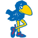
 The Jayhawks' first logo came in 1912, a blue feathered bird with a yellow beak and yellow legs to go along with blue shoes with red laces. This logo was first drawn by a student at Kansas, Henry Maloy. Since then, the Jayhawk logo has gone through some minor changes but also it's a fair share of major changes.

Kansas Jayhawks Primary Logo 1920 - 1923
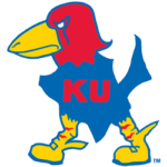
The school’s next logo change would come just three years later when they made the switch back to a more cartoonish logo which was the first step to resembling the logo we see today. A red-headed bird with a yellow beak, blue body, and red KU lettering on its body. This logo would last six years before its next major change in 1929.
The 1929 logo presented a much more fierce-looking Jayhawk with many of the same characteristics as its 1923 predecessor. A redhead, with a blue body, a yellow beak, and legs with red KU lettering on its body. That logo would be the longest-lasting to date for the university, as it would remain until 1941.
In 1941, the program would introduce its fifth logo in 29 years, a mixture of its 1929 logo and the logo that we see today. The Jayhawks remained with a fierce look but were in a much more detailed style, highly similar to today’s logo. Five years later, smaller changes would be made to the primary logo, the bird-flipping from facing left to facing right as well as changing the expression on the bird from fierce to a more happy look with white KU lettering on its body.
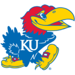
The final Kansas Jayhawks primary logo change would come in 2006, 60 years following the last logo change. Already a classic logo, the university decided not to make any drastic changes. In fact, the only notable change to the logo from its 1946 counterpart was the new font of the KU letter log on the body of the Jayhawk itself.
1912 - The original Jayhawks logo was drawn by Henry Maloy and features a blue bird with a yellow beak and yellow legs. There was a dash of red included in the logo as well with the bird’s red laces on its blue shoes.
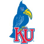
1920 - The 1920 logo saw a much more classic adaptation of bird logos, somewhat similar to that of the St. Louis Cardinals. This Jayhawks logo was primarily blue with a yellow beak and introduced red KU lettering at the front of the logo. The Jayhawk is self is perched on the letter K of the logo.
1923 - The logo returned to its cartoonish style roots in 1923 and begins to show a resemblance to the modern-day logo. The Jayhawks’ body remains blue but the head of the bird was changed to red to go with a much more exaggerated beak as well. The red KU lettering from the forefront of the logo is to be placed on the center of the Jayhawks' body.
 1929 - After being a much more happy looking bird, the 1929 iteration of the logo shows a much more fierce expression, perhaps battle-ready Jayhawk. Many of the features of the 1923 logo stayed the same including the blue body, redhead, and yellow beak and legs. The KU lettering also remained red and centered on the Jayhawks’ body.
1941 - The 1941 edition of the logo is the beginning of today’s logo. The right-facing Jayhawk became much more detailed but still has some cartoonish features to it. The features of the bird itself did not change nor did the expression upon its face. The KU lettering featured on the Jayhawk, did, how Bert change as it was now white instead of red.
 1946 - Changed shortly after the end of World War II, the sixth logo for the university had subtle changes. The expression on the Jayhawk was not much similar to the originals, a happy, welcoming expression. Notably, the logo was also flipped from facing right to facing left for those viewing the logo.
2006 - The final version and current version of the logo featured the only way noticeable change, that being the type font of the KU lettering on the body of the Jayhawk. It would, however, keep the white look of the lettering. The font is very similar to the one used in 1920 for the university’s second Jayhawk logo.
Check out the Big 12 Conference logo battle, support your Jayhawks in the battle.
Sports Logo History is a community of sports logo enthusiast who enjoys the history of each team’s logo history. Sports Logo History has primary logos, alternate logos, or wordmark logos from the NFL, NBA, MLB, MLS, NHL, Premier League, WNBA, CFL, NCAA, ABA, USFL, AAF, and XFL.
One of our partner sites Sports Team History takes a look at the history of each and every professional sports team. In addition, we have added Sports News History to our sports history websites. 24/7 non-stop sports news that's worth knowing. Finally, the premier sports team marketplace for your favorite team or college with thousands of items for you to peruse at Sports Market History.


