The history of Major League Soccer (MLS) is not the history of its franchises, matches, or championships; it is the complex visual catalog of the transformation of the USA's sporting culture. It talks about the transformation from the disorderly, boisterous experimentation of the 1990s to the sleek, business-minimalism of the digital era. No franchise has undergone this transformation more intensely than the one we now call the New York Red Bulls.
The visual narrative of the club, as the New York/New Jersey MetroStars, which was established in 1996, can be viewed as a microcosm of the overall development of sports branding. This change has been marked by a dramatic reversal of hyper-local, narrative-based maximalism, typified by the so-called MetroFlash aesthetic, toward a globalized, scalable, monolithic corporate identity. A sports logo is no longer simply a crest embroidered on a jersey; it is an interface element designed to function in the frictionless context of digital platforms.
This commentary carves apart that graphic path. It compares the semiotic gravitas of the initial MetroStars branding with the obnoxious standardization of the Red Bull era, questioning the role of the pixel-perfect requirements of the mobile internet in hastening the homogenization of the sports culture.
The Genesis of the "MetroFlash" Aesthetic (1994–2005)
Empire SC vs. The Kinetic City
Prior to the first ball being kicked during the first season in 1996, ownership of the MLS franchise in New York was a war zone. The club's original name was Empire Soccer Club. This title made one think of the grandeur of the Empire State, evoking Art Deco typography, building patterns, and a color scheme based on New York civic history. It was a permanent name, which was founded at the root of Manhattan.
But the business demands of the nineties came in. The team's initial owners, Metromedia, considered it a content vertical within a larger portfolio and demanded that it be referred to as Metro. At the same time, Nike, the league's main apparel sponsor, had been running at a high-intensity creative pace. Nike's design team pitched the concept of "MetroFlash"—a rejection of static heraldry in favor of kinetic energy.
MetroFlash aesthetic was based on the design spirit of the mid-90s. It attempted to embrace the kinetic, electric New York City: subways, neon lights, and the unsynchronous rhythm. This created a visual impression defined by jagged lines, aggressive typography, and the intentional breaking of symmetry.
Deconstructing the 1996 Crest

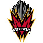
- The Skyline Motif: The most prominent motif was a stylized view of New York City's skyline. The buildings were usually black and grey, often compared to the Art Deco noir of Batman: The Animated Series, which made the team protectors of a tangible metropolis.
- The "M" Letterform: The main element of the logo was an enormous, red letter M. This was no ordinary character but an original graphic intended to appear electric, jagged, and vibrating with a slant that was in touch with the city's power grid.
- The Taxi Cab Palette: The team went with a special combination of black, red, and shadows of orange (yellow). Inspired by the ubiquity of NYC taxi cabs, this color scheme brought the team closer to street-level reality than the blue-and-orange of the Mets and Knicks.
The "Infamous Nike Template"
The visual identity was also applied to the kits, with the most prominent being the 1996 home jersey, which featured black-and-white zigzags/stripes on a red background. This notorious Nike design resembled a player, a motionless interference pattern, or a bolt of lightning. While traditionalists mocked it, the design succeeded in Nike's primary goal: it was impossible to ignore. It was a pictorial depiction of chaos and disturbance, which summed up the startup momentum of the new MLS quite well.
The Red Bull Era: Corporate Monolithism (2006–Present)
Branding as Colonization

This had never been seen in American sports. The MetroStars did not obtain a new sponsor; they were turned into one. The rebranding was a global approach to establish a network of sports teams, such as Red Bull Salzburg and RB Leipzig, that could serve as marketing vehicles for the beverage. Influences on the visual identity ceased to be based on the culture of the Hudson River region and shifted to brand guidelines at Fuschl am See, Austria.
Deconstructing the Global Standard
The New York Red Bulls logo is not a sports logo; it is a corporate trademark modified for sporting contexts.
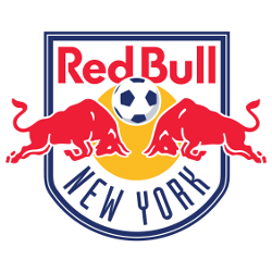
- The Sun and Bulls: Its main theme, the two red bulls walking into the yellow sun, is based on the Thai energy drink Krating Daeng. It is a representation of strength and violent energy.
- Standardization: The logo is almost identical to that of Salzburg and Leipzig. Such a franchise type provides a fan in Tokyo or London with immediate knowledge of the brand, no matter which team it happens to be.
- Futura Typography: The logo uses heavy, geometric sans-serif typography, often a variant of Futura. It conveys modernity, efficiency, and corporate order- a sharp contrast to the anarchic custom fonts of the MetroStars age.
The Trade-off: Place vs. Product
The shift to Red Bull aesthetics represented a clear trade-off: distinctiveness was sacrificed for global consistency. The MetroStars logo, with its city skyline and grit of Gotham, was admittedly New York. The Red Bull logo does not provide visual cues to its location; it signifies a worldwide Red Bull. Although this "corporate sleekness" introduced a certain professionalism the MetroStars sorely needed, it also created a sense of placelessness that many fans could not emotionally accept.
The Digital Imperative: Designing for the Algorithm
The change from MetroStars to Red Bulls can be compared to a technological shift in how logos are consumed. In 1996, logos were designed for CRT televisions and print. In 2025, a primary use case is as a digital asset within mobile ecosystems—digital platforms like DraftKings and streaming interfaces like Apple TV. This has imposed "Darwinian" pressures on design: only the scalable survive.
The Mobile Data Paradigm
Modern sports applications have the form of dense data display. A team logo can be shown on a mobile interface at the smallest possible size, 24x24 pixels.
- Scalability: The finer points of the 1996 MetroStars logo, the jagged skyscraper windows, the jagged M, would become lost in illegible noise at this scale. The Red Bull logo, in turn, is a masterpiece of scalability. Its rigid geometric lines and high-contrast colors (Red PMS 485 on Yellow PMS 123) serve as a unique visual cue, reducing cognitive load for the user.
- Dark Mode Compatibility: Nowadays, apps are increasingly adopting Dark Mode (#121212 backgrounds). The MetroStars logo, which relies heavily on black outlines, would be eliminated without the heavy-handed white keyline. Naturally, the yellow sun and silver outlines of the Red Bull logo are an obvious pop on dark backdrops without any adjustments.
- Vector Suitability: Scalable Vector Graphics (SVGs) have now become the industry standard. The 90s MetroFlash style, with its gradient-heavy, complex shading, is hard to translate into lightweight, clean code. The flat, solid colors of the Red Bull crest make the files smaller (under 50KB) and thereby the page loads faster, which is a very important measure when it comes to real-time interactions, where latency translates to missed updates.
API Data Feeds and Asset Management
The asset management in the background is driven by APIs. The sports data providers need the standard formats. Red Bull network visual consistency is what makes this backend integration easier. A developer creating a fantasy application can treat all Red Bull teams as a single visual group, making the code simpler.
The Shift from Badge to Icon
The digital pressure has necessitated a philosophical change of the Badge (a convoluted shield with a story) to the Icon (a practical graphic).
- MetroStars (Badge): Relates an urban and historical tale. Intended to be closely examined.
- Red Bulls (Icon): Functions like an app button. Shares brand identity in real time.
The Red Bull logo is a more valuable currency in the economy of attention, optimized for the best possible transactional environment of modern-day sports consumption.
The 2025 Paradigm: Apple TV and the Return of Bespoke Identity
Though the post-2006 years were characterized by corporate standardization, the 2020s saw a reversal of that trend, driven by the MLS and Apple TV partnership. Apple's UI is more immersive than transactional, as it uses high-resolution images on 4K displays.
Bespoke Sleeve Patches
In 2025, MLS and Apple launched custom sleeve patches that enabled clubs to reclaim local stories. Namely, teams such as Inter Miami (Vice City aesthetics) or LAFC (Art Deco wings) rifled the local culture. Nevertheless, the patch worn by the Red Bulls brought to light the Red Bull paradox.
Adhering to parent company regulations, the Red Bulls' "bespoke" patch only rearranged the components of the corporate logos, gold sun and red bull,s into the Apple profile. As the other teams mentioned cherry blossoms or civic history, the Red Bulls fell back on corporate signifiers. This helps highlight the contradiction: though one of the partners, such as Apple, might welcome the narratives, a global brand cannot return to local specifics without sacrificing its core identity.
Conclusion: The Future of the "Flex" Identity
The case study of the New York/New Jersey MetroStars' change to the New York Red Bulls illustrates the conflict between Place and Product, Narrative and Utility.
The MetroStars' identity was a desperate, beautiful attempt to capture the spirit of New York in 1996. It was flawed, unscalable, and chaotic, but it possessed a distinct sense of place. It was analog. The Red Bull identity represents its opposite: smooth, geometrical, and perfect to scale. It is very effective on a mobile screen. It is digital.
The future of MLS's visual identity may be the Flex Identity, which allows brands to expand towards immersive experiences and contract towards transactional ones. As digital platforms demand both clarity (for the algorithm) and authenticity (for the fan), franchises must find a way to temper corporate sleekness with the chaotic humanity that defined the MetroStars. The goal is a brand that is technically perfect for the app, but emotionally resonant for the stands.
===
Sports Logo History is a vibrant community of sports logo enthusiasts who share a deep appreciation for the captivating histories behind each team's logo. We take pleasure in exploring the evolution of primary logos, alternate logos, and wordmark logos from renowned leagues such as the NFL, NBA, MLB, MLS, NHL, Premier League, WNBA, CFL, NCAA, UFL, ABA, USFL, AAF, and XFL. Immerse yourself in the intricate details and stories behind these iconic symbols that represent the essence of each team.
In the enthralling realm of sports, the battle of logos among different leagues unfolds as a captivating and ongoing spectacle. Step into the world of Sports Logo History, where we showcase the relentless pursuit of distinction by leagues such as the NFL, NBA, MLB, Premier League, and countless others. Witness the captivating journey as each league strives to create logos that not only capture the essence of their sport but also resonate deeply with fans.
Immerse yourself in the comprehensive sports history provided by Sports Team History, our esteemed partner site, where you can discover the triumphs, challenges, and defining moments that have shaped the legacies of professional sports teams. Stay up to date with the latest sports news through Sports News History, a platform delivering 24/7 coverage of highlights, player interviews, and game analyses. Additionally, express your unwavering support for your favorite teams by exploring Sports Store History, the premier sports team marketplace offering a vast selection of jerseys, memorabilia, and collectibles. Join our community today and celebrate the rich history, iconic logos, and passion of sports.

