“Cleveland Indians are no more. Long live the Cleveland Guardians!” This is how the 2022 season began for this more-than-a-century-old baseball team. Criticized for using Native American symbols since the 1970s, it finally caved in and rebranded itself under the name Cleveland Guardians.
Its name, however, isn’t the only thing that has changed and evolved over the years. Its logo has, too – there have been 12 versions of it so far!
So, with the help of the experts at WritePaper.com, let’s look at the images synonymous with the Indians/Guardians over the years. Consider it a tribute to the century-old visual history of this Cleveland-based team!
How Indians Became Indians: A Short History
This Cleveland team has been in the game since around 1869. Back then, team naming was a random, hit-and-miss kind of process. The origins of the names were sometimes just murky.
For example, before the team settled on being the Indians after they were called:
- The Spiders;
- The Grand Rapid Rustlers;
- The Lakeshores;
- The Bluebirds/Blues;
- The Bronchos;
- The Napoleons/Naps.
The latter one was also among the most long-running names in the team’s pre-Indian history. Even though the team got named after its best player, Napoleon "Nap" Lajoie, the name stuck from 1903 to 1914.
But once Nap Lajoie had to return to the A’s, the team had a naming decision to make once again. The club’s owner at the time, Charles Somers, asked local newspapers to come up with one. Somehow, they settled on the Indians. Some say it’s a tribute to Louis Sockalexis, a Native American who played for the Spiders from 1897-1899.
It was supposed to be a temporary name until someone developed a better one. Yet, inexplicably, it stuck. And five years later, the Indians won the World Series in 1920 – and once that happens, you just have to keep the name.
How Chief Wahoo Became (& Stopped Being) the Team’s Logo
The team’s first official logo had hardly anything to do with its name at the time. It appeared in 1915 when the team was already called the Indians. Yet, it was just a block capital letter C that stood for Cleveland. That design served the team until 1921 – then, it was redesigned into a cursive capital C. The refreshed image was in use for six years, until 1928.
1928: A Rough Draft
This logo lasted just one season, but it’s probably for the better. It was crudely drawn, with uneven lines and child-like execution. It resembled the first draft of a logo by a beginner in design. It was represented by a profile of a Native American with three feathers colored red.
1929 - 1932: A Chief in a White Headdress
Cleveland Indians Primary Logo 1939 - 1945
One season later, the rough draft of a logo got replaced with a red-faced Native American chief wearing a white headdress. The image had black outlines, but their crudeness still resembled a child’s drawing.
1933 - 1938: A Yellow-Colored Chief
This was the time the team tried to completely redesign their logo. While it still pictured a Native American in a headdress, the skin color changed to yellow, and a green shirt was added to the mix. The headdress was detailed, with white, yellow, and red coloring the feathers.
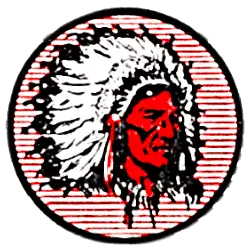
1939 - 1945: Adding a Circled Background
Another attempt at finding the image that would become iconic, this logo featured a red-skinned chief wearing a headdress against a red-and-white-striped circle background. The design’s style was more realistic than that of its predecessors. You could see the facial features outlined with great precision, for one.
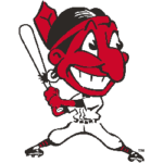
1946 - 1947: Chief Wahoo’s First Appearance
Cleveland Indians Primary Logo 1947 - 1950
You’ll recognize the cartoonish style of this one: it’s very similar to the longest-standing logo of the Indians. But this one portrays a Native American baseball player (soon to be known as Chief Wahoo) holding a bat. The toothy grin, the large eyes, and the red skin will also remind you of its successors.
1948: A Full-Face Portrait
For one short season, the club decided to replace the full-body caricature of a Native American baseball player with this full-face portrait of Chief Wahoo. The main elements of the image you’ll instantly recognize remain the same: the cartoonish style, the giant grin, and the no-less-giant eyes.
1949 - 1972: The First Iteration of the Famous Logo
This is the logo most fans associate with the team. It’s Chief Wahoo’s profile, with the red taking over the image. His cartoonish smile and giant eyes are in place, too. The image itself has a friendlier feel to it than its predecessor.
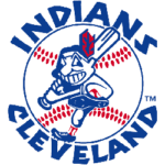
1973 - 1978: A Blue-Colored Reimagination
Cleveland Indians Primary Logo 1973 - 1979
The second most visually complex logo, this one switched the primary color to navy blue. In it, a baseball takes center stage. Around it, ‘Indians Cleveland’ is written in that classic-for-baseball block font. Against the baseball, you can still see Chief Wahoo standing with a baseball bat.
1979 - 1985: A Comeback to the 1949 Logo
That reimagination of the already-famous logo didn’t stick with the audience. That’s why the Indians reverted to their previous design after six seasons. There was one significant change, though – the image got vertically reflected.
1986 - 2013: A Subtle Color Palette Change
It’s the same design as the previous one – except for one tiny detail. That detail is the shade of red. Here, it was made brighter and more vibrant. That’s a quick trick to make any design stand out, so it’s no wonder the Indians used it.
2014 - 2020: The Return to a Block C

Cleveland Indians Primary Logo 2014 - Present
Considering the decades-long pushback against the Chief Wahoo mascot, the Indians changed their primary logo to a red block C in 2014. This one was minimalistic and resembled the very first logo of the club, except that the letter got thinner.
How Both the Name & Logo Got Protested
The club’s decision to rebrand itself as the Guardians didn’t come out of the blue. The movement against the name and logo started in the 1970s. The club defended using them, saying they “honor Native Americans.” But organizations like the National Congress of American Indians weren’t buying it.
The reason? Native American symbols by non-native sports teams reinforce harmful ethnical stereotypes. The logo itself is a caricature, nonetheless. Plus, on top of that, it means non-native teams can capitalize on the image of another ethnic group.
The Birth of a New Identity
Why Guardians? The club held hundreds of hours of interviews, brainstorming sessions, and a survey of 40,000 fans. Guardians turned out to be the number one option among almost 1,200.
 Sports Logo History
 Cleveland Guardians Primary Logo 2022 - Present
The name is inspired by Guardians of Traffic – eight statues on the Hope Memorial Bridge in Cleveland. They are the symbol of the progress in transportation – and the city itself.
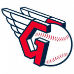
What does the logo look like now? It was revitalized as a block G with wings on the left and a baseball on the right behind it. Red remained the primary color, with a lot of white added to the mix and black outlines. A block C is also used in some merchandise, like baseball caps.
Wrap Up
As you can see, the team’s logo has greatly changed throughout its history. Despite that, its most recognizable features, like the cartoonish style or the color palette, remained in place (for most of the club’s history).
Of course, there’ll always be those who were for and against the team’s rebranding. Fans are fans, after all. But one thing is for sure: the club’s decision to move past the problematic brand identity is a sign to others that it’s feasible and worth doing.
Sports Logo History is a community of sports logo enthusiast who enjoys the history of each team’s logo history. Sports Logo History has primary logos, alternate logos, or wordmark logos from the NFL, NBA, MLB, MLS, NHL, Premier League, WNBA, CFL, NCAA, ABA, USFL, AAF, and XFL.
Our partner site is Sports Team History takes a look at the history of each and every professional sports team. In addition, we have added Sports News History to our sports history websites. 24/7 non-stop sports news that's worth knowing. Finally, the premier sports team marketplace for your favorite team or college with thousands of items for you to peruse at Sports Market History.
“Cleveland Indians are no more. Long live the Cleveland Guardians!” This is how the 2022 season began for this more-than-a-century-old baseball team. Criticized for using Native American symbols since the 1970s, it finally caved in and rebranded itself under the name Cleveland Guardians.
Its name, however, isn’t the only thing that has changed and evolved over the years. Its logo has, too – there have been 12 versions of it so far!
So, with the help of the experts at WritePaper.com, let’s look at the images synonymous with the Indians/Guardians over the years. Consider it a tribute to the century-old visual history of this Cleveland-based team!
How Indians Became Indians: A Short History
This Cleveland team has been in the game since around 1869. Back then, team naming was a random, hit-and-miss kind of process. The origins of the names were sometimes just murky.
For example, before the team settled on being the Indians after they were called:
- The Spiders;
- The Grand Rapid Rustlers;
- The Lakeshores;
- The Bluebirds/Blues;
- The Bronchos;
- The Napoleons/Naps.
The latter one was also among the most long-running names in the team’s pre-Indian history. Even though the team got named after its best player, Napoleon "Nap" Lajoie, the name stuck from 1903 to 1914.
But once Nap Lajoie had to return to the A’s, the team had a naming decision to make once again. The club’s owner at the time, Charles Somers, asked local newspapers to come up with one. Somehow, they settled on the Indians. Some say it’s a tribute to Louis Sockalexis, a Native American who played for the Spiders from 1897-1899.
It was supposed to be a temporary name until someone developed a better one. Yet, inexplicably, it stuck. And five years later, the Indians won the World Series in 1920 – and once that happens, you just have to keep the name.
How Chief Wahoo Became (& Stopped Being) the Team’s Logo
The team’s first official logo had hardly anything to do with its name at the time. It appeared in 1915 when the team was already called the Indians. Yet, it was just a block capital letter C that stood for Cleveland. That design served the team until 1921 – then, it was redesigned into a cursive capital C. The refreshed image was in use for six years, until 1928.
1928: A Rough Draft
This logo lasted just one season, but it’s probably for the better. It was crudely drawn, with uneven lines and child-like execution. It resembled the first draft of a logo by a beginner in design. It was represented by a profile of a Native American with three feathers colored red.
1929 - 1932: A Chief in a White Headdress

Cleveland Indians Primary Logo 1939 - 1945
One season later, the rough draft of a logo got replaced with a red-faced Native American chief wearing a white headdress. The image had black outlines, but their crudeness still resembled a child’s drawing.
1933 - 1938: A Yellow-Colored Chief
This was the time the team tried to completely redesign their logo. While it still pictured a Native American in a headdress, the skin color changed to yellow, and a green shirt was added to the mix. The headdress was detailed, with white, yellow, and red coloring the feathers.
1939 - 1945: Adding a Circled Background
Another attempt at finding the image that would become iconic, this logo featured a red-skinned chief wearing a headdress against a red-and-white-striped circle background. The design’s style was more realistic than that of its predecessors. You could see the facial features outlined with great precision, for one.
1946 - 1947: Chief Wahoo’s First Appearance

Cleveland Indians Primary Logo 1947 - 1950
You’ll recognize the cartoonish style of this one: it’s very similar to the longest-standing logo of the Indians. But this one portrays a Native American baseball player (soon to be known as Chief Wahoo) holding a bat. The toothy grin, the large eyes, and the red skin will also remind you of its successors.
1948: A Full-Face Portrait
For one short season, the club decided to replace the full-body caricature of a Native American baseball player with this full-face portrait of Chief Wahoo. The main elements of the image you’ll instantly recognize remain the same: the cartoonish style, the giant grin, and the no-less-giant eyes.
1949 - 1972: The First Iteration of the Famous Logo
This is the logo most fans associate with the team. It’s Chief Wahoo’s profile, with the red taking over the image. His cartoonish smile and giant eyes are in place, too. The image itself has a friendlier feel to it than its predecessor.
1973 - 1978: A Blue-Colored Reimagination

Cleveland Indians Primary Logo 1973 - 1979
The second most visually complex logo, this one switched the primary color to navy blue. In it, a baseball takes center stage. Around it, ‘Indians Cleveland’ is written in that classic-for-baseball block font. Against the baseball, you can still see Chief Wahoo standing with a baseball bat.
1979 - 1985: A Comeback to the 1949 Logo
That reimagination of the already-famous logo didn’t stick with the audience. That’s why the Indians reverted to their previous design after six seasons. There was one significant change, though – the image got vertically reflected.
1986 - 2013: A Subtle Color Palette Change
It’s the same design as the previous one – except for one tiny detail. That detail is the shade of red. Here, it was made brighter and more vibrant. That’s a quick trick to make any design stand out, so it’s no wonder the Indians used it.
2014 - 2020: The Return to a Block C

Cleveland Indians Primary Logo 2014 - Present
Considering the decades-long pushback against the Chief Wahoo mascot, the Indians changed their primary logo to a red block C in 2014. This one was minimalistic and resembled the very first logo of the club, except that the letter got thinner.
How Both the Name & Logo Got Protested
The club’s decision to rebrand itself as the Guardians didn’t come out of the blue. The movement against the name and logo started in the 1970s. The club defended using them, saying they “honor Native Americans.” But organizations like the National Congress of American Indians weren’t buying it.
The reason? Native American symbols by non-native sports teams reinforce harmful ethnical stereotypes. The logo itself is a caricature, nonetheless. Plus, on top of that, it means non-native teams can capitalize on the image of another ethnic group.
The Birth of a New Identity
Why Guardians? The club held hundreds of hours of interviews, brainstorming sessions, and a survey of 40,000 fans. Guardians turned out to be the number one option among almost 1,200.
 Sports Logo History
 Cleveland Guardians Primary Logo 2022 - Present
The name is inspired by Guardians of Traffic – eight statues on the Hope Memorial Bridge in Cleveland. They are the symbol of the progress in transportation – and the city itself.
What does the logo look like now? It was revitalized as a block G with wings on the left and a baseball on the right behind it. Red remained the primary color, with a lot of white added to the mix and black outlines. A block C is also used in some merchandise, like baseball caps.
Wrap Up
As you can see, the team’s logo has greatly changed throughout its history. Despite that, its most recognizable features, like the cartoonish style or the color palette, remained in place (for most of the club’s history).
Of course, there’ll always be those who were for and against the team’s rebranding. Fans are fans, after all. But one thing is for sure: the club’s decision to move past the problematic brand identity is a sign to others that it’s feasible and worth doing.

