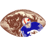
The well-known American professional football squad, the Buffalo Bills, has changed four logos throughout its half-century of existence. However, its fans always stayed loyal to this club in spite of all these alterations, as well as the fans of online Blackjack games for Philippines, are always faithful to their favorite online casinos.
1960 — 1961 / Bills Logo
There is no similarity between the first logo, which was introduced in 1961, and the current one. The first emblem of the Buffalo Bills depicted a herd of buffalo; there were also two players in the front part. The buffaloes had a brown and orange color palette, while the football players wore blue and white uniforms. One of them was gripping an orange football.
The team's name was written above the picture in a solid typeface and all parts were arranged inside a navy blue form bearing a resemblance to the football spaced in horizontal. This first trademark was in use by the Buffalo Bills for only a short time, as it was pretty simple; nevertheless, it was a vivid badge.
1962 — 1969 / Bills Logo

Buffalo Bills Primary Logo 1962 - 1969
The redesign of the previous logo retained its form, and the color palette remained unchanged. The redesign of the last logo maintained its form, and nearly the entire color palette has remained unchanged; only the composition has been replaced with a new one. The football was represented as a whole in white and brown shades, with the Buffalo being emphasized as the significant theme. On the right corner of the ball, the player was depicted, while around or on this option of the trademark, there was no inscription.
1970 — 1973 / Bills Logo
In 1970, the emblem was redesigned entirely, and a new one was introduced, which remained in use for three years. This one was simpler than its predecessor and minimalist among all the team's symbols. The red bison with a white eye became a new hero of the logo.
1974 — Present / Bills Logo

Buffalo Bills Primary Logo 1974 - Present
The Buffalo Bills' trademark was adopted in 1974 and features a more energetic and dynamic design. The core hero is again the buffalo in the process of charging, and a solid red line starts from its head. The last variation of the logo has been in existence for nearly 48 years. It has withstood the test of time, as this image comprises all the colors of the football team, excluding dark blue, which completely reminds fans of their beloved team and inspires them.
One more reason for the longevity of the current logo is that it depicts a running bison. In the fans' opinion, this logotype represents the animal's stubborn character, which never stops and always strives to achieve its goals, just like their beloved team, which has been committed to this pursuit over the years and has recorded numerous victories.
___
Sports Logo History is a vibrant community of sports logo enthusiasts who share a deep appreciation for the captivating histories behind each team's logo. We take pleasure in exploring the evolution of primary logos, alternate logos, and wordmark logos from renowned leagues such as the NFL, NBA, MLB, MLS, NHL, Premier League, WNBA, CFL, NCAA, UFL, ABA, USFL, AAF, and XFL. Immerse yourself in the intricate details and stories behind these iconic symbols that represent the essence of each team.
In the enthralling realm of sports, the battle of logos among different leagues unfolds as a captivating and ongoing spectacle. Step into the world of Sports Logo History, where we showcase the relentless pursuit of distinction by leagues such as the NFL, NBA, MLB, Premier League, and countless others. Witness the captivating journey as each league strives to create logos that not only capture the essence of their sport but also resonate deeply with fans.
Immerse yourself in the comprehensive sports history provided by Sports Team History, our esteemed partner site, where you can discover the triumphs, challenges, and defining moments that have shaped the legacies of professional sports teams. Stay up to date with the latest sports news through Sports News History, a platform delivering 24/7 coverage of highlights, player interviews, and game analyses. Additionally, express your unwavering support for your favorite teams by exploring Sports Store History, the premier sports team marketplace offering a vast selection of jerseys, memorabilia, and collectibles. Join our community today and celebrate the rich history, iconic logos, and passion of sports.

