The Toronto Argonauts will be bringing back its original logo that was founded nearly 150 years ago.
The 2021 Canadian Football League season is set to commence in early June, and at least one team will come into the year with a new, but pretty old, look. The Argos were established back in 1873 and has been a mainstay in the CFL ever since.

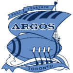
Toronto Argonauts Primary Logo 1956 - 1975
The Argos’ first logo took the shape of a ship with a big mast and flowing script. From 1873 to 1955, a ship was the face of the team. In 1976, the iconic football ship was instituted and became a fan-favorite. Instead of the traditional ship body, it was replaced with a football. Overtop was a flowing mast with an “A” signifying the Argonaut's name.
In 1983, this was Toronto’s primary logo for its Grey Cup championship run which remains as one of the team’s most iconic seasons. Many fans hold on to this year’s win as it snapped a 31-year title drought.
For the past 31 years, the ship was abandoned, and a different logo took its place. For a majority of that time, and up until this past season, the logo took the form of a shield with the “A” prominently in the middle.
Now, that shield will be used as a secondary logo in 2021. So, lovers of the basic look won’t be completely out of luck as it will still be around. However, the consensus among fans and organization members is in favor of the iconic boat.
Although the original football ship was only used for about 12 years originally, it is being reintroduced and modernized to kick off the 2021 season.

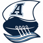
Toronto Argonauts Primary Logo 2021 - Present
The new version of the football ship will feature four oars dipping into the water below. Each oar symbolizes the team’s ability to work together to achieve a common goal. The goal would be to win a championship, but the literal symbolism is to propel the boat forward and into a new era.
“This contemporary redesign of one of our most iconic emblems reinforces the great tradition of the Argonauts while continuously steering towards the horizon and our future,” Toronto General Manager Michael Clemons said in a statement by the team. “We are so excited to bring back a logo that is beloved by so many Toronto Argonauts fans.”
The sleek mast flows over the top of the football and displays gives the logo yet another dimension. Plus, the “A” denotes the Argos’ name and compliments the main color scheme very well.
Although the logo is changing the traditional color scheme is not. The white mixed with Oxford Blue and Cambridge blue keeps Toronto’s identity intact.
With the slogan of “Pull Together” the ship does an excellent job of illustrating the tone that Toronto is trying to set going into the new year.
The bringing back of an iconic image mixed with a new twist will target fans of all ages. Be sure to see this logo in action when the play picks back up in June 2021.
See the Toronto Argonauts logo history and team history.
___
Sports Logo History is a vibrant community of sports logo enthusiasts who share a deep appreciation for the captivating histories behind each team's logo. We take pleasure in exploring the evolution of primary logos, alternate logos, and wordmark logos from renowned leagues such as the NFL, NBA, MLB, MLS, NHL, Premier League, WNBA, CFL, NCAA, UFL, ABA, USFL, AAF, and XFL. Immerse yourself in the intricate details and stories behind these iconic symbols that represent the essence of each team.
In the enthralling realm of sports, the battle of logos among different leagues unfolds as a captivating and ongoing spectacle. Step into the world of Sports Logo History, where we showcase the relentless pursuit of distinction by leagues such as the NFL, NBA, MLB, Premier League, and countless others. Witness the captivating journey as each league strives to create logos that not only capture the essence of their sport but also resonate deeply with fans.
Immerse yourself in the comprehensive sports history provided by Sports Team History, our esteemed partner site, where you can discover the triumphs, challenges, and defining moments that have shaped the legacies of professional sports teams. Stay up to date with the latest sports news through Sports News History, a platform delivering 24/7 coverage of highlights, player interviews, and game analyses. Additionally, express your unwavering support for your favorite teams by exploring Sports Store History, the premier sports team marketplace offering a vast selection of jerseys, memorabilia, and collectibles. Join our community today and celebrate the rich history, iconic logos, and passion of sports.

