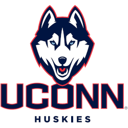
Connecticut Huskies
Jonathan Husky's head, now a front view of his blue, white, red and grey head with a red outline.

DePaul Blue Demons
New version of the letter "D" in blue with red trim in a custom font.
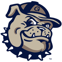
Georgetown Hoyas
Modernized bulldog wearing a cap with a letter "G" and a dog collar with spikes.
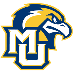
Marquette Golden Eagles
A blue, yellow and white Golden Eagle head shot with the letters "MU" in white with yellow trim on a blue formed background.
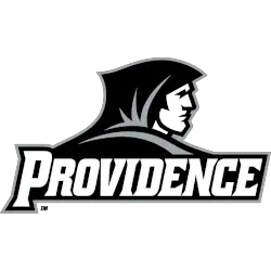
Providence Friars
A friar is facing to the right dressed in black and wordmark "PROVIDENCE" in white on a black background.
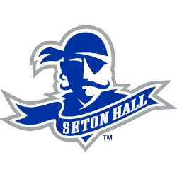
Seton Hall Pirates
A blue head shot of a Pirate with silver outline and a blue with white trim banner with a wordmark "SETON HALL" in white.
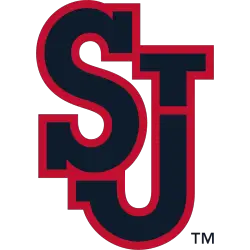
St. John's Red Storm
Blue initials "SJ" with red trim and a red line across the letter "J."


Big East Conference Logo History
The Big East Teams Alternate Logos reveal how each program added personality to its identity. Many designs focused on bold shapes and updated lettering to match modern styles. These changes helped teams share a consistent message while keeping their own traditions strong. For more information, you can visit the Big East Conference Wikipedia page.
Big East Conference Alternate Logo History Influence
The big east conference logo history played an important role in shaping alternate designs. As the conference updated its main mark, teams often refreshed their alternates to stay visually aligned. This process improved recognition, and it also strengthened the overall conference image. Because of this, alternate logos remain an important part of branding.
The main big east conference logo continues to guide visual updates across all programs. Each redesign brings cleaner lines and stronger color balance. These changes support both primary and alternate marks. To see more related branding updates, visit the Big East Conference Wordmark Logo Page for a full overview of wordmark variations.