
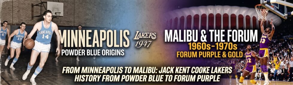
Put an old Minneapolis Lakers mark beside the familiar Los Angeles version, and the family resemblance is not hard to spot. The colors changed. The city changed. The design became faster and less literal. Yet the name remained, and so did the basketball at the center of the idea. That restraint is what makes Jack Kent Cooke Lakers history worth examining. Cooke did not need a completely different emblem to signal a new period. Purple and gold did most of the work. The result felt unmistakably Californian, although part of its structure had already been developed before the franchise left Minnesota. The Jack Kent Cooke Lakers history is a testament to the evolution of the team.
Minneapolis left more than a name
The narrative of the franchise is deeply intertwined with Jack Kent Cooke Lakers history. His influence transformed not only the team’s identity but also its place in popular culture.

The original identity made geographical sense. Minnesota was the Land of 10,000 Lakes, so “Lakers” needed little explanation. Early graphics could afford to be literal, using regional imagery, a basketball, and a light blue palette. Los Angeles inherited a name that no longer described its surroundings, but abandoning it would also have thrown away the recognition built around the team. The early LA look therefore behaved more like an edit than a reset. Minnesota disappeared from the artwork. Blue stayed. The lettering became more energetic, and the ball began functioning as a stage for the wordmark rather than a separate piece of local symbolism.
| Period | What a viewer saw first |
| Minneapolis | Place, basketball, pale blue. |
| Early Los Angeles | Name, movement, blue and white. |
| Forum years | Purple, gold, speed. |
When comparing the marks, four details deserve attention:
- The lean of the word “Lakers.”
- The lines running behind the letters.
- The changing role of the basketball.
- The amount of space given to “Los Angeles.”
- The contrast created by each palette.
Jack Kent Cooke Lakers history reaches The Forum
The color break arrived after owner jack Kent Cooke bought the team in 1965. The Lakers later moved into The Forum, Cooke’s new arena in Inglewood, and their appearance shifted from blue and white to purple and gold. Cooke reportedly disliked the word “purple,” though not the actual color. His solution was wonderfully specific: call it Forum Blue. The label attached the shade to the building and made an ordinary color name sound like part of the franchise. In Jack Kent Cooke Lakers history, this detail is revealing. The redesign was partly visual, but the language surrounding it helped sell the change.
| Feature | Earlier look | Cooke-era choice | What remained |
| Dark color | Blue. | Purple, called Forum Blue. | Strong contrast. |
| Light color | White or gold. | Gold. | Two-color clarity. |
| Lettering | Slanted wordmark. | Slanted wordmark. | Forward motion. |
| Ball | Graphic support. | Graphic support. | Basketball context. |
The transformation was straightforward:
- Keep the Lakers name.
- Retain the moving wordmark and ball.
- Replace the cool palette with purple and gold.
- Connect the new color language to The Forum.
Why the Lakers “L” never needed rescuing
The first letter is not a stand-alone icon, but it starts the motion that carries through the entire word. Its forward angle, heavy shape, and relationship with the trailing lines make the logo feel active before a player or hoop appears. Jack Kent Cooke changed the Lakers’ visual history by altering the letter’s surroundings rather than its basic job. Gold made the wordmark brighter. Forum Blue gave it depth. Later versions cleaned up proportions and outlines, but the underlying trick survived. That is the clearest lesson in Jack Kent Cooke Lakers history: recognition often depends less on preserving every color than on knowing which piece of the design is already doing the real work.