
The Call of the North Coast: Why ‘Sirens’ Beats the Rockers’ Ghost
Cleveland’s 20-year wait for WNBA basketball didn’t end quietly. The return of women’s professional basketball to Northeast Ohio carries a $250 million price tag — the expansion fee Rock Entertainment Group paid to secure the franchise ahead of its 2028 debut, according to the Associated Press. That figure alone signals how seriously ownership views this franchise as a long-term civic institution, not a nostalgia project.
And nostalgia, it turns out, is exactly what the leadership team worked to avoid. When fans began speculating online — asking “can anyone guess the new WNBA team name?” — many assumed the original Cleveland Rockers identity would return. Instead, the organization committed to a year-long research and community engagement process, deliberately pursuing what team president Allison Howard describes as a progressive identity independent of both the Cavaliers organization and the franchise’s own past.
“We knew that this team needed to be tied to our greatest asset: Lake Erie.” — Allison Howard, Cleveland Sirens President
That philosophy produced the Sirens — a name rooted in Great Lakes mythology and Cleveland geography rather than borrowed equity. The Cleveland Sirens WNBA logo history begins not with a design brief, but with a deliberate cultural decision: this team would stand on its own. What that identity actually looks like in the wordmark and color system is where the story gets genuinely compelling.
Hidden in Plain Sight: Decoding the ‘CLE’ Wordmark Typography

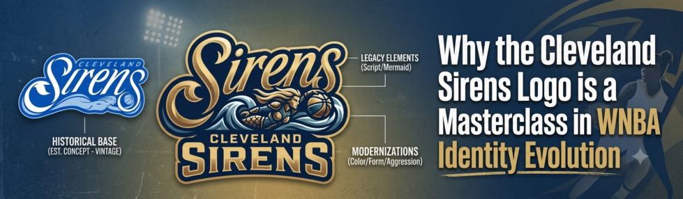
The Cleveland Sirens visual identity evolution reaches its most technically ambitious moment inside a single letter. At first glance, the primary mark is a bold, confident “S” — but look closer and you’ll find an entire city hiding within it.
According to Kee On Sports, the “S” wordmark deliberately conceals the letters “CLE” within its construction. This kind of typographic layering isn’t accidental — it’s the hallmark of a design team that understands identity building at a structural level. The best sports logos reward the fans who look twice, and the Sirens’ primary mark absolutely delivers that payoff.
The hidden elements break down across three distinct design choices:
- The embedded “CLE” — the city abbreviation is woven into the negative space and stroke geometry of the “S” form
- Reverberating sound waves — the wordmark accents echo outward like audio ripples, referencing both the mythological Sirens’ call and Cleveland’s deep music heritage
- Weighted stroke contrast — thick-to-thin transitions mirror the visual rhythm of a soundwave in motion
Compared to the straightforward guitar-shaped lettering of Cleveland’s previous WNBA franchise, this mark operates on a completely different level of conceptual sophistication. The design philosophy, described by the organization as “distinctly and authentically Cleveland,” prioritizes local resonance over generic sports aesthetics. Every typographic decision earns its place. And that philosophy extends beyond the wordmark itself — into the waves, the figures, and the layered geography you’ll see woven throughout the broader identity system.
The Five Waves: Geography and Gameplay in Iconography
The Sirens logo layers two distinct meanings into a single visual element — a design decision that sets a new benchmark for wnba expansion team branding cleveland fans and analysts are still unpacking.
According to Kee On Sports, the five waves woven through the mark represent both the five Great Lakes and the five players on a basketball court. That dual symbolism is rare: one motif doing two jobs without straining either meaning. Geography and gameplay fused into a single stroke.
The Great Lakes Connection runs deeper than a surface nod to regional identity. Lake Erie defines Cleveland’s northern horizon, but the full chain — Superior, Michigan, Huron, Erie, and Ontario — frames the entire economic and cultural corridor that Northeast Ohio belongs to. Anchoring the logo to all five lakes positions the Sirens as a regional franchise, not just a city team. It’s the kind of geographic ambition that, say, the Valkyries’ Bay Bridge imagery mirrors on the West Coast — local landmark, broader resonance.
The Siren figure beneath the wordmark reinforces the wave count through fluid motion. Her silhouette doesn’t hold a static pose; she moves through the waves the way a point guard moves through a defense — low, purposeful, and hard to stop. That kinetic quality keeps the icon from reading as decorative mythology and plants it firmly in athletic context.
And that athleticism connects directly to the next layer of identity the design team was solving for: color. The waves carry meaning, but it’s the palette that will tell you exactly where — and when — this franchise comes from.
Erie Blue: The Color Palette as a Historical Bridge
The Cleveland Sirens’ primary logo design earns much of its emotional resonance not from shape alone, but from the deliberate weight carried by two shades of blue. The official palette — ‘Sirens Blue’ and ‘Erie Blue’ — functions as a direct visual tribute to the Cleveland Rockers, the WNBA franchise that called the city home from 1997 to 2003, according to Just Women’s Sports.
Historical continuity is the strategic engine behind this decision. The Rockers built their identity around cool blue tones — a palette that Cleveland fans associated with women’s basketball for nearly a decade before the franchise folded. By anchoring the Sirens’ branding in those same hues, the organization signals that this isn’t a fresh start so much as a homecoming. You can see the thread connecting both eras clearly when you compare the Rockers’ original branding from 1997–2003 to what the Sirens have unveiled.
Market differentiation is the other half of the equation. Cleveland’s NBA franchise leans heavily into wine and gold — colors that dominate the city’s sports visual landscape. Choosing blue sidesteps any risk of the Sirens feeling like a satellite brand orbiting a larger team. Instead, the palette carves out distinct, ownable territory, giving the Sirens their own identity within a crowded Cleveland sports market. It’s a calculated move that honors the past while staking a confident claim on the future — and it sets up the reveal experience as something worth examining on its own terms.
The Power and Pull: A Review of the Visual Identity Reveal

The Cleveland WNBA expansion team didn’t just launch a logo — it launched a fully realized brand narrative, and the “Hear the Call” reveal video set the standard for how that narrative would unfold.
The reveal campaign treated the brand as a story, not an announcement. According to Bleacher Report, the video leaned into mythological imagery, Lake Erie’s raw power, and Cleveland’s hardworking identity — each visual beat reinforcing the same theme. Nothing felt disconnected. The “Hear the Call” tagline didn’t just describe a siren’s song; it extended an invitation to a city that’s been waiting for women’s basketball to return.
Compared to recent expansion peers, the Sirens hold their own. The Golden State Valkyries’ wordmark and their striking alternate identity established a high bar for WNBA expansion branding — bold, mythological, unapologetically modern. The Sirens match that ambition while adding something the Valkyries didn’t need to: a deep local history anchor.
That local grounding matters because the organization spent over a year conducting focus groups and market research to ensure the “Sirens” name delivered a genuinely progressive identity, according to Front Office Sports. In the modern sports landscape, that kind of deliberate community-building separates a memorable brand from a forgettable one. Every element — name, color, logo, campaign — was built to last.
With the visual identity now fully mapped, the key details that make this launch remarkable are worth collecting in one place.
The Bottom Line: Key Takeaways on the Sirens’ Debut
The Cleveland Sirens’ visual identity isn’t just a strong logo — it’s a carefully engineered brand statement built to carry decades of meaning.
The investment is real. The $250M franchise commitment signals ownership’s long-term intent, and with the Sirens set to officially begin play in the 2028 WNBA season, the branding had to arrive ready for the long game. This isn’t placeholder identity work — it’s a foundation.
Here’s what makes the design worth studying closely:
- The hidden ‘CLE’ typography embedded within the primary ‘S’ rewards careful attention, folding local identity directly into the mark without crowding the silhouette.
- The five-wave pattern isn’t decorative — it maps directly to Lake Erie and the broader Great Lakes geography, grounding the team in place rather than abstraction.
- The Erie Blue color palette closes a deliberate loop back to the Cleveland Rockers, honoring the city’s original WNBA chapter while pushing the visual language forward.
What you’re looking at is layered craft. Every element — typography, color, iconography — carries a specific referential or geographic load. That kind of intentionality is what separates logos that fade from logos that last.
And whether those layers hold up across decades is a question worth exploring — which is exactly where the conversation around Cleveland’s branding legacy is headed next.
Preserving the Legacy: Why Cleveland’s Branding Matters
The Cleveland Sirens logo is already a strong candidate for future classic status — a design built with enough symbolic depth and visual discipline to remain meaningful long after its debut season. That’s the quiet secret of well-crafted sports iconography: logos that encode genuine cultural meaning don’t age the way trend-chasing designs do. They become more resonant over time, not less.
The reveal slogan said it plainly — “We’re back” — and those two words carry the full weight of Cleveland’s women’s basketball history. That’s the kind of intentionality that separates a branding moment from a branding movement. When the Sirens take the court in 2028, their visual identity won’t just represent a new team; it’ll represent a city’s return to something it lost.
Longevity in sports design belongs to logos that have something to say. For anyone tracking Cleveland’s broader visual identity story — from the city’s basketball roots through its modern reinvention — exploring the full arc of Cleveland’s visual identity offers essential context for understanding just how significant this moment is. The Sirens don’t exist in a vacuum; they’re the latest chapter in one of American sports’ most visually rich regional narratives. Following that evolution is the best way to appreciate what the team has built — and where it might go next.