

The Atlanta Falcons’ logo is one of the most famous in the NFL. It has been closely tied to the team’s identity for almost 60 years and has also evolved with changes in sports design. Many business franchises have been renamed drastically; the Falcons are just the opposite. They’ve carefully worked on their visual identity, keeping the elements that their fans are familiar with and tweaking them for new generations.
A successful sports logo isn’t just decorative art attached to the top of a helmet or a sports jersey. It is a reminder of history, a symbol of pride, and a connection to memorable victories and the team and its supporters. The Atlanta Falcons’ logo is a perfect example of how careful you need to be in creating a logo that will last for decades and maintain the original feeling.
The Beginning of the Falcons Identity

The Falcons were an expansion team in the NFL in 1966. From the beginning, the club needed a symbol that would represent strength, speed, and determination. The design was a black falcon with red highlights, and it had a shape that resembled the letter “F. These two elements were merged in an idea that produced a logo that was both symbolic and easily recognizable.
The Falcons opted for a clean logo with a strong silhouette, which was uncommon among many sports logos in the ’60s, when many featured elaborate drawings. This was a good decision, as the logo could be applied to helmets, uniforms, printed programs, TV screens, and merchandise without losing its impact.
Color was also a major factor in the vibrant color palette. The black, red, and white contrasted effectively with each other and were clearly visible from back to front from every seat in the stadium and various media platforms.
How the Logo Changed Without Losing Its Identity
One reason the logo has been so long-lasting is that each iteration pays homage to the original idea rather than completely disregarding it.
The original, first edition, released in 1966, had a traditional illustration style with softer lines. By 1990, the art was modified to produce cleaner lines with the familiar falcon form.
The biggest change came in 2003. The designers changed the appearance of the bird, making it more aggressive; they sharpened the wings and modernized the outline, and added silver accents. The logo was more dynamic but still familiar to fans, as the design was kept intact.
It’s a lesson that can be learned in the world of sports branding: Evolution is sometimes better than a complete rebranding.
Why Consistency Creates Stronger Fan Recognition
Sports organizations rely on familiarity. Fans develop an emotional bond with symbols that live long in the past and repeated exposure reinforces these memories.
The Falcons logo is featured throughout supporters’ interactions with the team:
- Game helmets
- Official uniforms
- Stadium signage
- Television graphics
- Team merchandise
- Digital platforms
- Community events
Having the same logo on all platforms means that fans immediately link it with the franchise. For younger fans, it creates a sense of familiarity and trust in the brand, while for those who have bought into the brand for decades, it remains emotionally attached.
Beyond the stadium, visual identity is also a crucial element. Sports groups often showcase their past through memorabilia shows, fan expos, and league exhibitions. At these times, a 20×20 exhibit booth provides teams with ample space to showcase historic uniforms, championship memorabilia, interactive media and logo timelines to help the visitor understand the evolution of the brand over the years.
Design Features That Have Stood the Test of Time
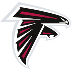
There are a number of reasons why the Atlanta Falcons logo continues to be effective.
The silhouette is unique: It’s easy to recognize even if it’s not colored.
Secondly, the logo conveys motion. The wings, head, and claws evoke an impression of a bird preparing to attack, as does the competitive spirit of professional football players.
Thirdly, the design is simple and detailed. It has enough visual elements to look different but not so complex that it is hard to reproduce at various sizes and across materials.
Last but not least, the logo is flexible and can adjust to new technology. It has stood the test of time, both on vintage game programs and on modern high-definition scoreboards.
Lessons Other Sports Teams Can Learn
Many franchises upgrade their branding to follow design trends. But many redesigns can hurt brand loyalty and diminish the emotional connection people have to a team’s name.
Here are a few simple rules the Falcons illustrate about successful branding:
- Maintain the integrity of the symbol (core).
- Update in small steps, rather than all at once.
- Consistently use the same colors on each platform.
- Use the logo in all Fan Experiences.
- Honor the team’s legacy and enhance the visuals.
These values have been the foundation of many of the world’s most successful sports brands.
Why the Falcons Logo Still Matters Today
The Atlanta Falcons logo is one of the most iconic logos in the NFL, having been around for almost sixty years. More than just a football team. It brings back memories of great games, familial bonds, and years of devotion to the franchise for many.
But the logo has been well designed and not hurriedly changed. Each update has added clarity and modern style while maintaining the same design fans were familiar with. It’s the mixture of tradition and progress that makes the Falcons one of the best-known brands in pro football.
The Atlanta Falcons are another classic example of a brand that doesn’t have to reinvent itself in order to be memorable and continue to grow in the digital arena, as well as on the field and in the stadium. Sometimes the strongest identity is the one that knows what must never be done.