
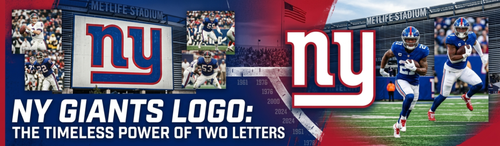
Most NFL logos have moved in one direction over the decades: more detail, more shading, more going on. The New York Giants went the other way. The mark the team uses today is two lowercase letters, and it is very close to something the franchise first put on its helmets more than sixty years ago. The story of how it got there, wandered away, and came back is one of the more interesting identity arcs in the league. This evolution reflects the enduring significance of the NY Giants logo.
Before the letters: the giant quarterback
The NY Giants logo is not just a symbol; it represents the team’s history and connection with its fans.
Understanding the history behind the NY Giants logo can deepen the appreciation for the team’s identity and legacy.
The Giants did not start with a monogram at all. For much of the 1950s, the club’s identity was built around an illustrated “giant quarterback”, a towering figure shown about to throw a football, originally created by artist Marie Barclay Steinmuller. In its early forms, the giant loomed over the New York City skyline; a later version placed him above Yankee Stadium, the team’s home during that period. It was expressive and of its era, but it was also busy, the kind of detailed illustration that works on a printed program and struggles nearly everywhere else.
1961: the “ny” arrives
The turning point came in 1961, when a stylized lowercase “ny” was added to both sides of the team’s helmet. The letters simply stood for New York, rendered in a custom typeface drawn specifically for the club: two bold lowercase characters, the tail of the “y” folding left to run underneath the “n” like an underline. It was clean, instantly legible, and readable at a glance from the back row of the stadium. The Giants used it, essentially unchanged, from 1961 through 1974.
What makes that debut notable in hindsight is how modern it looks. Plenty of the illustrative logos from the same era have dated badly. The 1961 “ny” could be introduced as a new mark today and few would blink.
| The lowercase “ny” first appeared on Giants helmets in 1961 — and the version worn today is largely the same mark with a red outline added. |
The detour: uppercase, then a wordmark
Then the franchise spent a couple of decades talking itself out of a good thing. In 1975 the team briefly switched to a stylized uppercase “NY”, white with blue accents, which lasted only a single season. In 1976 it changed again, this time dropping the monogram entirely in favor of a bold, italicized, all-capitals GIANTS wordmark, underlined and set in a narrow sans-serif. That change was tied to a real-world move: the team had relocated its operations to the Meadowlands in New Jersey, and the plain “GIANTS” sidestepped the awkward question of which state the letters “ny” were pointing at. The wordmark stuck around for more than twenty years.
2000: coming home to the monogram
For the 2000 season, and the franchise’s 75th year, the Giants went back. The lowercase “ny” returned as the primary logo, essentially the 1961 mark with one addition: a thin red outline, tying it to the team’s blue-red-white palette. The GIANTS wordmark was not thrown out; it was demoted to a secondary script logo, where it still lives today. Bringing back a New York monogram while the team played its home games in New Jersey did raise eyebrows, and owner Wellington Mara addressed it directly, saying the team was “not attempting to make a political statement.”
Whatever the intent, the design logic was sound. The team had spent forty years learning that its strongest asset was the simplest one it ever drew, and in 2000 it stopped fighting that.
Why the simple mark won
The Giants’ logo history is, in miniature, the story of what has happened to sports branding generally. A mark no longer lives mainly on a helmet and a printed program. It has to survive as a tiny app icon, a social avatar cropped to a circle, a favicon, an embroidered patch, a phone wallpaper. Detail is a liability at those sizes; a bold two-letter monogram is close to indestructible. The Giants are hardly alone in this: the Dallas Cowboys’ lone star has barely changed since 1964 for the same reason. The 1961 designers could not have anticipated the specific screens their work would end up on, but they drew something that happened to be perfectly built for them.
It also travels. The Giants, like every NFL franchise, now have followers well beyond the tri-state area and well beyond the United States, fans who know the marks intimately from screens rather than from Sundays at the stadium, and who often lean on a US-based connection to keep up with an American team from abroad. A logo that stays crisp at any size is exactly the kind that reads the same to a viewer in London or Frankfurt as it does on the sideline. PIA’s American server network is detailed on their site.
For a franchise founded in 1925, it took until the turn of the century to fully commit to the idea that less was more. The reward is a logo that has aged better than almost anything around it: two lowercase letters, a folded tail, a thin red line, and nothing else that needs explaining.