
The Leak That Launched a Thousand Memes
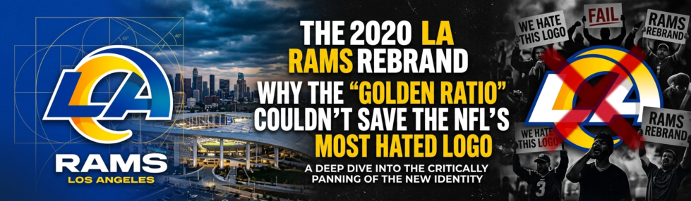
When evaluating the LA Rams logo controversy in 2020, it’s important to understand the key differences. The LA Rams logo controversy of 2020 didn’t begin with a polished press release — it began with a hat photo on Reddit. Weeks before the official March 23, 2020, launch, images of merchandise bearing the new design surfaced online, giving fans an unfiltered first look at what the franchise had been quietly developing. This incident paved the way for discussions around the 2020 LA Rams rebrand.
The initial reaction was outright disbelief. So many fans assumed the leaked images were fabricated that early Reddit threads were filled with users calling it a prank or a placeholder design. The logo simply didn’t read as the work of a major NFL franchise investing in a premium brand identity; instead, critics on social media compared the flashy gradients and neon palette to the generic aesthetic of an online casino or a mobile gaming app. When the official reveal confirmed the leak was genuine, the backlash escalated from confusion to genuine hostility, marking a pivotal moment in the narrative of the 2020 LA Rams rebrand.
When evaluating the LA Rams logo controversy in 2020, it’s important to understand the key differences. The LA Rams logo controversy of 2020 didn’t begin with a polished press release — it began with a hat photo on Reddit. Weeks before the official March 23, 2020, launch, images of merchandise bearing the new design surfaced online, giving fans an unfiltered first look at what the franchise had been quietly developing. This moment signifies the heart of the 2020 LA Rams rebrand.
The initial reaction was outright disbelief. So many fans assumed the leaked images were fabricated that early Reddit threads filled with users calling it a prank or a placeholder design. The logo simply didn’t read as the work of a major NFL franchise investing in a premium brand identity. When the official reveal confirmed the leak was genuine, the backlash escalated from confusion to genuine hostility, showcasing the complexities of the 2020 LA Rams rebrand.
The timing made everything worse. The Rams were preparing for the move to SoFi Stadium, a $5.5 billion facility designed to signal the franchise’s arrival as a premier Los Angeles institution. A bold, confident rebrand should have amplified that momentum. Instead, as The Guardian reported, the new logo angered an entire fanbase at precisely the moment the organization needed goodwill most.
That the team proceeded without any visible course correction revealed a significant disconnect between the design team’s vision and what fans actually wanted. And the deeper you look at the specific design choices — the interlock, the ram’s horn, the visual similarities to another LA team — the clearer it becomes why the backlash was so immediate and so lasting.
Anatomy of a Failure: The ‘LA’ Interlock and the Broken Horn
The 2020 Rams rebrand earned its place among the worst sports logo redesigns in NFL history for reasons that go well beyond personal taste — specific, identifiable design choices made it an easy target.
The ‘LA’ interlock logo drew immediate fire for its gradient treatment. That blue-to-yellow fade felt lifted straight from a mid-2000s energy drink label rather than a storied football franchise. Fans felt the logo looked like a generic news station or a lifestyle brand rather than a gritty football team, and it’s hard to argue with that read. The letterforms lacked the visual weight you’d expect from a professional sports identity.
The ‘A’ created its own problem. The interior swoosh cut through the letter, drawing uncomfortable comparisons to the Los Angeles Chargers’ lightning bolt — an unforced error that no NFL team can afford. When your new logo is visually confused with a divisional rival, the rebrand has already failed.
Then there’s the ram’s head. The most viral criticism centered on the curved horn, which observers pointed out had an unmistakably unfortunate phallic appearance. The “broken horn” tag stuck immediately, and once you see it, you can’t unsee it. That’s a branding nightmare.
What made each of these flaws compound was the combination — gradient, awkward swoosh, broken horn, all at once. The Rams and Nike would later lean heavily on design theory to justify these choices, but that explanation only fueled more frustration.
The Golden Ratio Defense: When Design Theory Backfires
Math can’t rescue a logo that fails the eye test — and the Rams found that out the hard way when their design rationale became the story.

When fans and critics asked why the Rams changed their logo in the first place, the official answer leaned hard into design theory. The Rams and Nike rolled out an explanation built around Fibonacci sequences and the Golden Ratio, framing the horn’s curve as a mathematically precise achievement. If a logo needs a geometry lecture to make sense, it’s already lost.
The internet wasn’t impressed. Design communities and sports fans quickly labeled the justification pseudo-intellectual fluff, arguing that the Golden Ratio is applied retroactively to almost any curved shape — it’s a rhetorical move, not a creative triumph. The comparison that really stung was to Lucent Technologies, the telecom company whose circular logo bears an uncomfortable resemblance to the Rams’ new mark. Suddenly, a franchise rebranding for a gleaming new stadium was being compared to a 1990s corporate identity package.
This points to a broader pattern in sports branding: storytelling that designers find compelling rarely lands with fans. When a team’s creative brief prioritizes mathematical elegance over emotional connection, the result feels like a logo built for a portfolio presentation rather than a jersey. Fans bond with symbols that feel earned, not engineered. The SB Nation ranking of Rams logos through history makes clear that the franchise had genuinely iconic marks to draw from — which made the pivot to “trust us, it’s geometric” all the more deflating.
And the branding confusion didn’t stop at math. As the dust settled on the Rams’ reveal, another LA team was about to drop its own refresh — setting up a direct, uncomfortable comparison that would define how both franchises were perceived in their shared city.
Identity Crisis: Rams vs. Chargers in the Battle for LA
The 2020 Rams rebrand didn’t happen in a vacuum — it landed at the exact same moment the Chargers unveiled their own highly praised refresh, and the contrast was brutal.
When two teams share a stadium, brand differentiation isn’t optional — it’s survival. The Chargers stripped back to a clean, confident bolt design that fans and designers immediately celebrated. The Rams, meanwhile, introduced a swoosh on their “A” that drew immediate comparisons to that very same lightning bolt. The swoosh looked remarkably similar to the Chargers’ signature mark, diluting the Rams’ brand equity at the worst possible time. Fans scrolling through social media weren’t just confused — they were mocking the overlap, and the jokes spread fast.
The timing compounded a deeper strategic failure. The Rams had a genuinely distinctive visual history: “Royal and Sol,” a color palette rooted in decades of Los Angeles identity. Instead of leaning into that heritage, the rebrand chased a look that felt more like a generic LA souvenir than a storied franchise’s identity. It’s one of the reasons the logo consistently ranks among the most hated NFL logos of all time.
That confusion carried directly onto the field at SoFi Stadium. With both franchises playing in the same building, clear visual identity matters enormously for atmosphere and merchandise — and the Rams’ look simply didn’t cut through. Whether that on-field identity crisis ultimately matters when a championship trophy is involved is exactly the question worth asking next.
Does a Super Bowl Ring Validate a Bad Logo?
Winning a championship doesn’t erase a design’s flaws — but it does complicate the conversation in ways that even the harshest critics can’t ignore.
Winning a Super Bowl is the ultimate rebrand. When the Rams won Super Bowl LVI in February 2022, they were wearing those very uniforms that had sparked one of the most heated debates in NFL logo redesign failures in recent memory. History is littered with examples of initially mocked aesthetics that became beloved simply because a team won in them. The 2020 look suddenly had a championship attached to it, and that changes the cultural math considerably.
But here’s the important distinction: “iconic” and “successful” aren’t the same thing. A logo can appear on a Lombardi Trophy and still be a design failure. Success on the field creates emotional associations, not aesthetic ones. Fans may now tolerate the uniform out of nostalgia for the win — but tolerance isn’t endorsement.
And the Rams’ actions tell the real story. The organization has already moved toward a uniform and brand refresh ahead of the 2026 season, quietly acknowledging what fans had been saying for years. You don’t refresh a design that’s genuinely working. The championship validated the team — not the logo — and that’s a distinction worth carrying into the broader lessons this rebrand left behind.
The Bottom Line: Lessons from the Rams’ Rebrand
The 2020 rebrand offers some of the clearest cautionary lessons in Los Angeles Rams branding history — and the sports design world more broadly.
When a fanbase this vocal tells you the logo isn’t working, the logo isn’t working. The leak-driven backlash that erupted before the design even officially launched wasn’t just noise. It was a signal the organization chose to ignore, and the resentment compounded with every passing season. As Golf Digest noted in its ranking of the worst logo changes in NFL history, the Rams earned the top spot — a distinction no franchise wants.
Here are the four takeaways every designer and sports brand manager should carry forward:
Listen to the fans. Pre-launch feedback — even when it arrives through a leak — reflects real emotional investment. Dismissing it breeds long-term resentment that a Super Bowl ring can only partially offset.
Avoid over-engineering. The golden ratio is a tool, not a substitute for a design that passes the basic eye test. Math-driven precision means nothing if the output looks awkward on a helmet at game speed.
Respect the core asset. The horn is the Rams’ most recognizable visual element. Fragmenting it into a stylized “LA” shape undermined the one thing fans universally loved.
Differentiation matters in a shared market. In a city split between two NFL franchises, looking too similar to your rival isn’t just an aesthetic problem — it’s a strategic one.
The good news? The Rams heard the criticism eventually. Their announced brand refresh ahead of the 2026 season signals an organizational course correction. But understanding why the 2020 design failed requires looking at the full arc of the franchise’s visual identity — and that history runs much deeper than one controversial rebrand.
Preserving the Horns: A Look Back at Rams History
The 2020 logo is just one chapter in a visual story that stretches back to 1937 — and understanding that history makes the misstep sting even more. According to Sports Logo History, the Rams’ visual legacy spans nearly nine decades and includes some of the most recognizable helmet designs the NFL has ever produced. That heritage is precisely what made the 2020 redesign so difficult to defend.
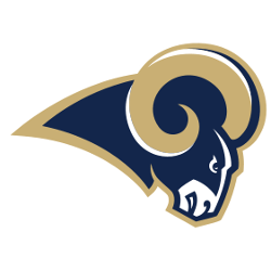
Nowhere is the contrast sharper than between the 2020 gradient horns and the clean, confident yellow horns of the 1970s era. The classic version communicated strength through simplicity — a bold, unambiguous mark that needed no mathematical justification to resonate. The LA Rams fan reaction to the 2020 rebrand was so swift and unified because supporters intuitively understood what had been traded away: clarity, continuity, and decades of earned visual equity. SB Nation’s ranking of Rams logos through the years makes that generational gap between the classic and modern marks impossible to ignore.
Sports heritage is not nostalgia for its own sake — it’s the accumulated identity that connects a franchise to its community across generations. When a rebrand severs that thread, fans don’t just lose a logo; they lose a shared visual language. The full timeline of the Rams’ evolution is a reminder that great sports design tends to grow from authenticity rather than algorithmic precision. Explore that history for yourself and see where the Rams’ identity has been at its strongest — the contrast will tell you everything you need to know about where the 2020 rebrand went wrong.
Key La Rams Logo Controversy 2020 Takeaways
Respect the core asset. The horn is the Rams’ most recognizable visual element. Fragmenting it into a stylized “LA” shape undermined the one thing fans universally loved.
Differentiation matters in a shared market. In a city split between two NFL franchises, looking too similar to your rival isn’t just an aesthetic problem — it’s a strategic one.
The initial reaction was outright disbelief.
The ‘LA’ interlock logo drew immediate fire for its gradient treatment.
When your new logo is visually confused with a divisional rival, the rebrand has already failed.
The LA Rams’ logo redesign in 2020 remains a pivotal example in sports branding discussions. Engaging with the reasons why the Rams changed their logo and analyzing the worst sports logo redesigns helps us understand the complexities of aligning team identity with fan expectations.