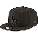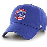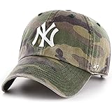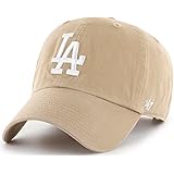
Sports Fan Products
Wordmark Logo
Over the years, sports wordmark logos have played a significant role in the visual identity of various sports teams and organizations. These logos, often consisting solely of stylized text, have become iconic symbols that instantly evoke a sense of team spirit and loyalty. Let's dive into the captivating history of sports wordmark logos and explore their evolution.
The concept of wordmark logos began to gain prominence in the mid-20th century as sports teams sought to establish a unique and recognizable identity. In the early days, wordmarks were straightforward, featuring the team name written in bold, blocky lettering. These logos represented the team's identity but lacked the flair and creativity seen in later designs.
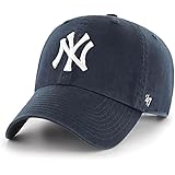
As graphic design techniques advanced, sports wordmark logos incorporated more intricate typography and stylized elements. In the 1970s and 1980s, teams began experimenting with custom lettering, adding unique touches to their logos. The New York Yankees, for example, introduced a classic wordmark logo with interlocking letters that instantly became synonymous with the team's rich history and success.
In the 1990s and 2000s, wordmark logos underwent further transformations, reflecting the changing design trends of the time. Many teams embraced sleek and modern aesthetics, opting for minimalist designs with clean lines and refined typography. The Chicago Bulls, for instance, unveiled a streamlined wordmark logo that exuded strength and elegance, perfectly complementing the team's dominance on the basketball court.
In recent years, wordmark logos have continued to evolve to keep pace with contemporary design sensibilities. Teams are exploring styles, from bold and dynamic lettering to more artistic and expressive typography. The focus is on creating a visually striking logo that captures the team's essence and resonates with fans meaningfully.
Sports wordmark logos have become a powerful visual representation of a team's identity, evoking a sense of pride and unity among fans. These logos encapsulate the team's history, values, and aspirations, often becoming symbols of tradition and success. Whether it's the iconic fonts of the Los Angeles Lakers or the stylish script of the New York Mets, sports wordmark logos leave an indelible mark on the world of sports branding, captivating fans and forging an enduring connection between teams and their supporters.
