
The Chicago Blackhawks logo is an enduring symbol of the team's storied history and unwavering resilience. Crafted with meticulous attention to detail, this emblem not only represents the franchise but also embodies the spirit of the city of Chicago itself. Evolving yet retaining its essence, the logo proudly incorporates elements of Native American heritage, honoring the traditions and values that have shaped the team and its fan base. The logo has served as a beacon of unity through triumphs and challenges, rallying fans from all walks of life under a standard banner of pride and passion for the game. Platform Papersowl offers invaluable resources for delving into the more profound historical significance and cultural context surrounding the logo. It provides scholarly insights and analyses that enrich our understanding of its profound impact on sports culture. With Papersowl's assistance, enthusiasts can get professional writing work on the intricate narratives woven into the logo's design, gaining a deeper appreciation for its role as a mainstay in hockey lore and Chicago's cultural fabric. As the Chicago Blackhawks continue to etch their legacy on the ice, their logo remains a timeless emblem of identity, tradition, and the enduring connection between team and community.
The franchise was named after a World War I military unit nicknamed the Blackhawk Division. The Blackhawks have won 16 division championships and 6 Stanley Cups. The latest Stanley Cup triumph was during the 2014-2015 season.
Players like Bobby Hull, Patrick Kane, Chris Chelios, Ed Belfour, and Jonathan Toews have played for this franchise.
When one takes a look at the primary logo history of the Blackhawks, one will notice that there is a distinct common denominator in all of the primary logos. All of the Blackhawks' primary logos have had a Blackhawk logo facing left. In this piece, we will go over all of the primary logos in the history of the Chicago Blackhawks.
The first primary logo in franchise history was designed one year after the franchise was founded. It was a black and white circular logo. On the upper half of the circle, there is a white “BLACKHAWKS” wordmark. The lower half of the circle contains a white “CHICAGO” wordmark. The exterior of the circle includes a black-and-white outline.
The inner portion of the circle contains the first-ever version of the Blackhawks logo within a black background. The head of the Blackhawk is drawn in black and white. This logo lasted until 1936.
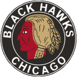 In 1936, all versions of the previous logo remained the same except for the head of the Blackhawk. The significant difference is that color was introduced to the Blackhawk head. Instead of black and white, the hair of the Blackhawk’s head was changed to a distinguished light brown. The blackhawk’s face was changed to a dark red. The addition of the Blackhawk's color to this design breathed new life into it. The primary logo lasted until 1938.
In 1938, all parts of the previous logo remained the same except for one key difference. The background of the inner circle, featuring the Blackhawk head, changed from black to white. That fundamental change helped the Blackhawk head stand out more in the design. This primary logo lasted from 1938 to 1942.
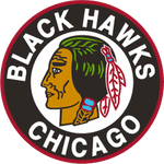 In 1942, several changes were made to the design. The “BLACKHAWKS” wordmark is still in the upper half of the circle, and the “CHICAGO” wordmark is still in the lower half of the circle. Both are still colored white. However, both wordmarks have a bolder font than the previous logos. Additionally, the outer half of the circle now features a bold red outline, replacing the last white outline. However, the most notable design is within the Blackhawk head.
The color scheme of the Blackhawk is no longer light brown and dark red. The color scheme of the Blackhawk has now been updated to feature green, red, and blue. The Blackhawk is still contained within a white background. This primary logo lasted until 1956.
In 1956, the Blackhawk head had additional feathers added in various colors. Also, red war paint was added to the black hawk’s face. Another critical addition to the design was the inclusion of a red outline on the exterior end of the inner circle, set against a white background. This lasted until 1958.
In 1958, the design was slightly altered regarding the color of the multicolored feathers. In particular, the feather on the far right was changed from dark green to light green. This design lasted until 1966.
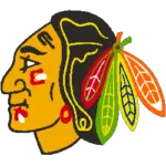 In 1966, the Blackhawks discontinued their circular logo in all designs. They eliminated the circle and the wordmarks it contained. The logo features a larger version of the Blackhawk head, contained within the inner circle of the previous design, set against a white background. The only slight difference is that there’s less of a yellow outline in the hair of the Blackhawk head. Subtle changes were made to the face and hair outline. The logo lasted until 1997.
From 1997 to 2000, the face of the Blackhawk head was darkened from light orange to dark orange. The outline's color in the Blackhawk’s hair changed from orange to yellow.
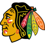 In 2000, the Blackhawk head’s facial color was changed back to light orange. The franchise has maintained this design ever since.
There have been few franchises that have maintained a logo design for as long as the Blackhawks have. I doubt it will go away in the foreseeable future.