
When examining the history of the Baltimore Orioles franchise, it becomes clear that the organization has a history that predates its move to Baltimore. Very few individuals knew that the franchise was originally founded in Milwaukee. Long before articles on how to bet on baseball using cryptocurrency were written, the franchise was originally known as the Milwaukee Brewers. Initially, the Brewers competed in a league known as the Western League for the first 5 years before transitioning to the American League in 1900 and 1901. One year later, the franchise would relocate to St Louis and be known as the St Louis Browns. The franchise would be in St Louis for five decades before relocating to Baltimore in 1954.
It is no secret that the franchise has achieved its most tremendous success since being known as the Baltimore Orioles. Throughout its time in Baltimore, the franchise has won seven American League pennants and won the World Series three times (1966, 1970, 1983). Legendary players such as Cal Ripken Jr, Eddie Murray, Frank Robinson, and Brooks Robinson have played for this franchise.
The Baltimore Orioles have had many solid primary brand identifiers over the years. In this piece, we will rank all of the primary logos for the Baltimore Orioles.
8. Baltimore Orioles Dark Orange Circular Logo with Bat-Wielding Oriole / 1966 - 1989
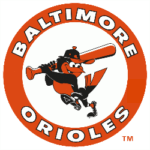 This logo was the second created by the franchise after they relocated to Baltimore. The logo is a circular logo colored dark orange with the “Baltimore Orioles” wordmark. The Baltimore Orioles wordmark is colored white. The “BALTIMORE” wordmark is on the top half of the logo in a semicircle. The lower half of the logo features the “ORIOLES” wordmark at the bottom of the circular design. The key part of this logo is the black and dark orange oriole wielding a dark orange bat. He is wearing a cap and has his left leg raised. The oriole is clearly in the midst of a baseball swing.
7. Baltimore Orioles Light Orange Circular Logo with Bat-Wielding Oriole / 1989 - 1992
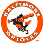 This logo is essentially a slight alteration of the previous logo that was described. The significant difference is that the dark orange elements of the logo have been replaced with a brighter shade of orange. The brighter shade of orange can be seen in the circular logo, the oriole, and the baseball hat in the oriole’s hand. This change in color serves as an upgrade as it helps the design to stand out more. It is more pleasing to the eye.
6. Baltimore Orioles Baseball Logo with Perched Oriole and Criss-Cross Bats / 1954 - 1966
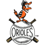 This was the first logo that the city had upon its arrival in Baltimore. This design has an element of simplicity that makes it quite endearing. The center of the logo is a white knitted baseball. A black “ORIOLES” wordmark lies right in the middle of the baseball and right between the upper and lower knitted parts of the ball. In the back of the baseball, one can see the upper and lower portions of two brown baseball bats. Although it’s mostly obscured, the baseball bats form a crisscross pattern behind the bats. On top of the baseball, a happy black, orange, and white oriole can be seen.
5. Baltimore Orioles Scripted Logo with Oriole on Top / 1992 - 1995
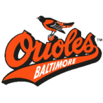 This scripted logo represents the 1st iteration of the bubble-scripted Baltimore Orioles wordmark. The scripted “Orioles” logo features an orange background, and it contains a black and orange oriole perched on the “I” of the “Orioles” wordmark. The “S” of the “Orioles” wordmark has a long tail that extends from right to left. In the middle of the tail, a white “Baltimore” wordmark can be seen.
4. Baltimore Orioles Scripted Logo with Oriole on Top / 2009 - 2019
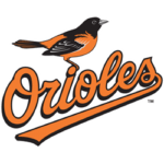 The highlight of this logo is this beautiful, scripted “ORIOLES” wordmark. The wordmark is colored orange and has a black outline. It is pretty simplistic and poignant.
On top of the “ORIOLES” wordmark, a black & orange oriole can be seen standing on the dot of the “I” of the “ORIOLES” wordmark. This logo is accentuated by the fact that the oriole stands out so prominently.
3, Baltimore Orioles Scripted Logo with Oriole On Top and Baseball Diamond / 1995 - 1998
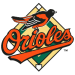 This logo effectively captures the essence of the Baltimore Orioles. It contains a scripted “ORIOLES” wordmark with the long tail from the “S” wordmark that goes from right to left of the logo. An orange, black, and white oriole can be seen on top of the “I” wordmark. However, the bird has dotted eyes and a very short beak.
In the background, a green and yellow baseball diamond is visible. The exterior and center of the diamond are yellow, while the green portion is contained in the inner portion.
2. Baltimore Orioles Scripted Logo with Enhanced Oriole and Baseball Diamond / 1998 - 1999
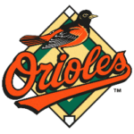 The logo nearly fits the entire description of the previous logo. The only key difference is that there is a significant upgrade to the oriole on top of the “I” in the Orioles wordmark. Although the oriole is still white, black, and orange, there is more artistic detail in the oriole’s body. There is more definition in the eyes of the oriole. Additionally, the oriole’s beak is longer.
1. Baltimore Orioles Scripted Logo with Enhanced Oriole and Baseball Diamond / 1999 - 2009
 It was just as described in the previous logo. The only slight difference is that there is more clarity in the oriole’s eyes and that the beak is slightly narrower. These subtle changes helped this logo to stand above all other prior Orioles logos.