The Indianapolis Colts are a team with a great history and outstanding accomplishments. The team was formed in 1953 and was able to surprise the entire NFL community in a short period. The club is owned by Jim Irsay and has Frank Reich as the head coach. The team is very confident in dealing with opponents in championships like writepaperfor.me with tricky assignments. In some way, the team's success is associated with the logo. It reflects the luck of the athletes and their desire for sporting heights.
Meaning and History
When creating a club logo and choosing colors, the Indianapolis Colts show a desirable consistency. Moreover, the club's managers are quite conservative and prefer time-tested ideas. Therefore, the central theme was settled in 1953. However, the main part of the emblem, which is relevant at the moment, appeared only in 1979.
The blue and white combination is the perfect symbiosis, identifying determination, loyalty to the fans, and pursuing achievement while keeping a cool head. In some way, this interpretation of the emblem is quite logical, given the strategic decisions made by the team's coaches in each season.
1953 — 1960

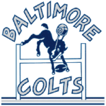
Baltimore Colts Primary Logo 1953 - 1960
The team was initially founded in Baltimore in 1953. And the first logo featured a dark blue horse jumping over an obstacle. So the animal's helmet looked like it had come off from the jump, and a rugby ball was caught between its front hooves. Also, the "Baltimore" part in all capitals was arched, while the "Colts," also in all caps, was written horizontally. As you can see, this combination of letters and colors signaled the team's readiness for radical action and the desire to win every match.
1961 — 1978
In 1961, the club's owners decided that the original emblem did not entirely reflect the team's determination to win and decided to go for a redesign. As a result, some details have been removed. At the same time, the horse and sports equipment remained intact. In addition, the style of the emblem has changed. The silhouette of the horse has become more brutal, reflecting the masculinity of the athletes and their will to win. The helmet and the rugby ball became hollow, with a white color in the middle. It is worth noting that the fan community warmly received such changes.
1979 — 1983

Baltimore Colts Primary Logo 1979 - 1983
Since 1979, the main emblem has been transformed into the legendary blue horseshoe with seven white grommets. However, the color scheme has remained unchanged. In addition, the horseshoe was chosen for a reason. This part of the emblem represents luck, team motivation, and the will to win. Moreover, the club's founder was born in Baltimore, where horse racing was especially popular. That is why the horseshoe became the symbol of the team until 1983.
1984 — 2001
In 1984, the club made a minor redesign of the primary logo. The contours of the horseshoe were refined, but nothing was changed. This approach can be explained by the conservatism of the club owners and the unwillingness to change what worked well for years. By the way, in 1984, a different logo appeared, used as the secondary symbol. It is a bold blue inscription in all capitals, executed in a wild-west style serif typeface. Many team fans liked this innovation, as the old logo was not significantly changed, and its alternative looked beautiful.
2002 — Today
 Sports Logo History
 In general, the redesign did not bring any significant changes. The only caveat is a new shade of blue. It became darker and calmer. And the white grommets are slightly enlarged and are more distinct now. Overall, the redesign was relevant to team management, who wanted a more contrasting badge on the athletes' uniforms. Otherwise, the fan community did not notice any significant changes, so the new version of the logo was perceived as neutral.
Additional Logo
The horseshoe is still the team's primary logo, while management decided to redesign the secondary logo. The extra emblem is now composed of a bold blue "C" with seven white grommets, resembling the iconic logo. In addition, the inner contour of the letter repeats the contour of the Indiana state. Such symbolism looks especially pleasing to fans who appreciate the team's victories and adherence to tradition.
Shape
The horseshoe was chosen because the club owner was born in Baltimore. Since this city is the heart of horse racing, the choice of the logo was obvious. In addition, the horseshoe depicted on helmets and uniforms looked brutal and added confidence to the athletes. In other words, the chosen logo served a stylistic and motivational function. And do not forget that many athletes are superstitious, and the horseshoe gives them the strength to fight on the field until victory.
Colors
The whole history of the logo is closely connected with white and blue colors. Blue symbolizes excellence and the thirst for victory; white represents purity and charm. In other words, the logo signals that the team is ready to fight for trophies with passion but, at the same time, intends to go to the championship with a cool head. Therefore, this color scheme accurately reflects the club's historical strategy and athletes.
The $17 Million Caitlin Clark Effect: How One Rookie Changed the WNBA Forever
Visit Our YouTube Channel
