There are quite a few teams that have had many logo changes over the course of their history. With regards to the NFL, the Washington Football Team has had the most logo changes in NFL history. In terms of frequency, the Cincinnati Bengals have changed their logo more frequently than anyone else in NFL history.
Betting activity on the Patriots has also increased over the last few years. As more states have legalized sports betting, so too has the interest in backing popular football teams. As legal sports betting has expanded rapidly in the US, the Patriots have been one of the most bet on teams in the league.
However, there are some NFL franchises with logos that have stood the test of time. Somehow, these franchises have managed to get logos with tremendous staying power. A great example of a franchise with a long-lasting logo is the New England Patriots. The New England Patriots have had only two logos in the history of their franchise.

Boston Patriots Primary Logo 1960
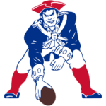
From 1961-1992, the New England Patriots used a logo that involves a minuteman from the Revolutionary War that is getting ready to hike the football like a center getting ready to snap the football to a quarterback. During the 31-year history of this logo, the design of the logo had slight variations. In all versions of this logo, the minuteman had knee-high red socks, white pants, a navy blue jacket, and a red tricorn hat. The first version of this logo had the minutemen with googly eyes and a cartoonish face. Additionally, the minutemen had white skin and he was hiking a white football with a red outline.
In 1972, the team made slight modifications to the logo. The minutemen’s skin color was tanner. They got rid of the face with googly eyes and made the face more realistic. Additionally, the football that the minutemen hiked was colored brown. In 1989, the logo was modified so that the minutemen’s skin was made white again just like the first version.

New England Patriots Primary Logo 1989 - 1992
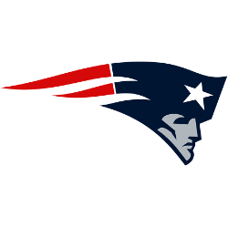
In 1993, the New England Patriots would change the logo to the iconic logo that we have all come to know. The logo contains a gray face of a minuteman with a red, white, and blue banner-like hat. This logo would remain for six years. In 2000, the logo was modified slightly. The face of the minutemen was changed to silver and the blue color of the minutemen’s hat was altered to navy blue. This version still remains to this day.
Based on recent NFL history, there’s only one overarching reason why this logo has lasted so long. It is due to the recent success of the New England Patriots.
One would mostly assume that the reason for the staying power of this logo is due to an iconic and memorable design. Yet, the current logo of the Patriots is rather simplistic. I feel that the previous logo design was more iconic and memorable. In terms of design, it is an attention-grabber to see an intimidating minuteman poised to snap a football. It was much more sophisticated and detailed.

New England Patriots Primary Logo 2000 - Present
The New England Patriots franchise has had a great deal of success since changing its logo in 1993. As a matter of fact, they have been the most successful franchise in the NFL in that timespan. Between 1993-present, the New England Patriots have a win-loss record of 313-151. Their success has largely occurred due to the iconic pairing of the greatest QB/Coach duo in NFL History.
Over that span, the New England Patriots have won 20 division championships. They have made playoff appearances 22 times. Out of 22 playoff appearances, the Patriots managed to make it to the Super Bowl ten times. They won 6 Super Bowl championships as a franchise over that time span. Currently, the Patriots are tied with the Steelers for the most Super Bowl titles in NFL history.
There is no doubt that the recent success of the New England Patriots franchise has deepened the sense of loyalty of the Patriots fanbase to the organization. Additionally, the Patriots have become synonymous with success in the National Football League. Therefore, the logo has become a symbolic representation of a successful and prestigious brand. It is similar to how an individual that loves watches would view a brand such as Porsche, Gucci, or Louie Vuitton. The loyalty to the brand is due to the success and prestige of the brand. One finds themselves in a fortunate and advantageous position due to their association with the brand. He or she may even feel a sense of superiority.
Even though the design is simplistic, the design of the logo pales in comparison to the success of the franchise represented in it. This success is the foundational reason why this logo has lasted for so long. One can certainly expect this logo to last for years to come.
Sports Logo History is a community of sports logo enthusiast who enjoys the history of each team’s logo history. Sports Logo History has primary logos, alternate logos, wordmark logos, or concept logos from the NFL, NBA, MLB, MLS, NHL, Premier League, WNBA, CFL, NCAA, ABA, USFL, AAF, and XFL.
Our partner site is Sports Team History takes a look at the history of each and every professional sports team. In addition, we have added Sports News History to our sports history websites. 24/7 non-stop sports news that's worth knowing. Finally, the premier sports team marketplace for your favorite team or college with thousands of items for you to peruse at Sports Market History.

