It is no secret that the New England Revolution has generated a fair amount of prestige in its twenty-seven years of existence as a franchise. The franchise has played in 5 MLS Cup Finals. They have won two major trophies. One of them is the 2007 U.S Open Cup as well as the 2021 Supporters Shield for having the best regular-season record.
No matter how long a sports franchise or company is in existence, it is perfectly reasonable for a franchise to engage in a rebrand via a new logo. Let’s take a look at their logo history.
 Sports Logo History
 New England Revolution Primary Logo 2009 - 2021
The New England Revolution’s first primary logo consists of a wordmark black “New England” and a purple airbrushed “Revolution” logo. Between 1996 and 1999, the New England Revolution’s first logo was a registered trademark logo. That can be seen as the logo has an R with a circle around it on the right-hand side of the logo. The highlight of their old primary logo can be seen with 5 red airbrushed red stripes. This is reminiscent of the stripes that one will see on the American flag. The major difference is that these stripes curve quite a bit more while the stripes on the American Flag are straight. Finally, the logo has a purple soccer ball that matches in color with the team’s purple “Revolution” logo. From 2000-2008, the logo became a trademark.
In 2009, the New England Revolution took away the wordmark “New England” and “Revolution" and just had the red airbrushed flags and the purple soccer ball.
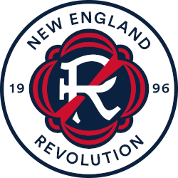
In 2022, the New England Revolution have unveiled a new logo that is vastly different than its predecessor. The New England Revolution’s new logo contained a white circular background. The “New England” watermark can be seen across the top of the circle while the “Revolution” wordmark can be seen across the end of the bottom.
On the far left of the circle, the number “19” wordmark can be seen while the number “96” can be seen in the far right of the circle. This was made to represent the year 1996. This was the inaugural season of the MLS and the New England Revolution was one of the league’s charter teams.
 Sports Logo History
 New England Revolution Primary Logo 2022 - Present
In the middle of the circle, there was a white classic-looking “R” contained within a purple background within the interior of the circle. Red lines can be seen near the outside of the purple background. Additionally, there is a big emphatic red line that goes down the left side of the white “R” and even serves to obscure some parts of it.
“We’re building an identity that we hope will be with us for the long-term. We don’t plan to do this again,” said Cathal Conlon, the Revolution’s Vice President of Marketing and Community Engagement. “We hope that this sticks with us and it becomes who we are and our fans resonate with it and rally around it.”
Sports Logo History is a community of sports logo enthusiast who enjoys the history of each team’s logo history. Sports Logo History has primary logos, alternate logos, wordmark logos, or concept logos from the NFL, NBA, MLB, MLS, NHL, Premier League, WNBA, CFL, NCAA, ABA, USFL, AAF, and XFL.
Our partner site is Sports Team History takes a look at the history of each and every professional sports team. In addition, we have added Sports News History to our sports history websites. 24/7 non-stop sports news that's worth knowing. Finally, the premier sports team marketplace for your favorite team or college with thousands of items for you to peruse at Sports Market History.

